Design Leader · AI & Product
Michael Tsirakis
I'm a designer who loves making AI feel human. Currently at Netflix, previously at Google, LinkedIn, Apple & eBay.
Selected Work
Projects Where I've Made Impact
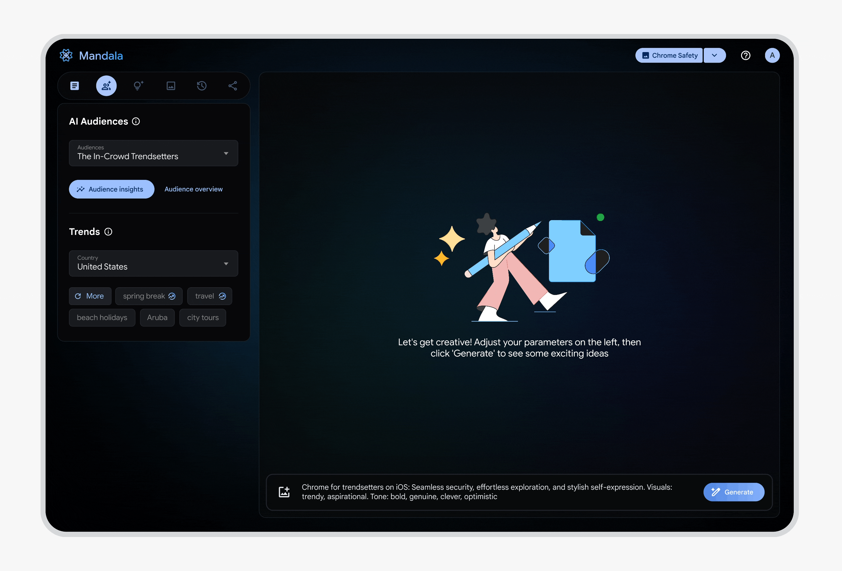
Project Mandala
Led 0-1 AI vision securing SVP buy-in. 60% faster campaigns, 45% productivity gains.
SVP+ stakeholder buy-in
SMB Hiring Experience
Redesigned SMB hiring for busy owners. 60% more hires, 185% more responses.
+60% successful hires
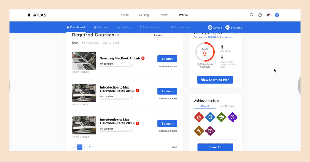
Global Training Platform
Rebuilt training platform for 500K+ users. 73% more completions, 4.6★ rating.
500K+ global users
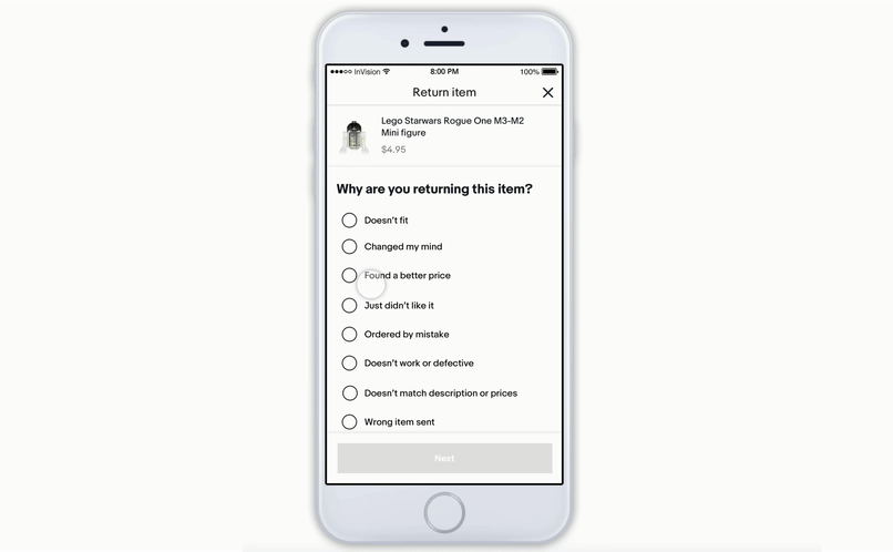
Returns Experience
Transformed the returns experience. 64% faster, $2.3M saved annually.
+64% completion rate
About Me
The human behind the screens
Las Vegas, NV
Originally from Toronto
Hey! I'm a Senior Interaction Designer at Netflix, where I get to work on AI experiences that reach millions of people.
Before Netflix, I spent time at Google, LinkedIn, Apple, and eBay. Along the way, I've learned that the best design happens when you really listen to people and keep things simple. I'm passionate about creating intuitive, accessible interfaces that make complex technology feel effortless.
I thrive in ambiguous problem spaces where research and prototyping can uncover unexpected solutions. Whether it's reimagining recruiter workflows or building AI-powered creative tools, I love turning complicated challenges into elegant experiences.
When I'm not designing, you'll probably find me on the basketball court, exploring a new city, or on the hunt for the perfect iced coffee.
Iced Coffee Enthusiast
Fueled by cold brew, always
☕ Click to play!Basketball Lover
Hoops keep me grounded
🏀 Click to play!World Traveler
30+ countries and counting
✈️ Click to play!Where I've Been
My Journey
Netflix
Senior Interaction Designer
Senior Interaction Designer
Product Designer
Apple
UX Designer
eBay
UX Designer
Giving Back
Beyond Work
Speaking
Guest Presentations
Judging
Design Competitions
SCAD StartUp '26
Semi-Finals Judge for SCAD's annual design entrepreneurship competition.
UpcomingMentorship
Portfolio Reviews
"Michael helped me completely rethink my case study structure. My projects finally tell a compelling story instead of just listing features."
"He pushed me to inject more of my personality into my portfolio. It finally feels like me, not just another generic design site."
Kind Words
What People Say
"Michael brought super useful and great insights to the table. He always demonstrated solid experience in the tools and system we used, and was always open-minded, receptive to feedback and extremely easy to work with."
"Michael is an MVP teammate that any company is lucky to have. He has the amazing ability to grasp complicated systems in a very short time. Michael can also quickly create a lot of content and is very thoughtful and generous with his feedback."
"Thanks for your outstanding work the last couple months helping craft our MarkEng vision. Your ability to transform our strategy document into a compelling story is superb! Your future looking mocks will be used by a VP of marketing to pitch our value."
Let's Connect
Say hi, I'd
love to chat
Whether you want to talk design, collaborate on something cool, or have me speak at your school — drop me a line! I'm always happy to connect.
Say Hello