Doyenne: A female mentorship app
Mentoring can be a great way to share knowledge and help someone be successful in their personal or professional life. But many potential mentors are often too busy to commit to regular meetings, or they have a hard time connecting with people seeking help. My task was to design an experience where prospective mentors and mentees can be matched, based on similar interests, location, and availability.
Problem overview
At all stages of one's career, mentors play an important role. Unfortunately, for many people, finding a great mentor remains a challenge. Consider an entry-level engineer wanting to connect with STEM leaders, or a university student needing insight on a project. They use a subpar app that matches them with a few mentors. Since the app did not suggest mentors that meet their criteria, they soon find that their mentor matches are not providing them with value or knowledge.
Solution overview
Doyenne is a mentorship app that gets to know both the mentor and mentee first, learning about their professional life, goals and interests. From there, Doyenne will match potential mentors and prospective mentees based on similar, personalized preferences and interests. The app’s focus will be on providing users with the knowledge, encouragement and advice they need to grow in their personal and professional lives.
Prototype of my solution (Video)
Research 🔎
Understand task
I started this design exercise by brainstorming initial ideas in order to explore the topic of mentorship at a high level and to write down my early thoughts. With research being the first part of my design process, I wrote down an overview of my research process to determine my methodology, target participants and questions to ask. In addition, I thought of some early hypotheses and assumptions based on the prompt.
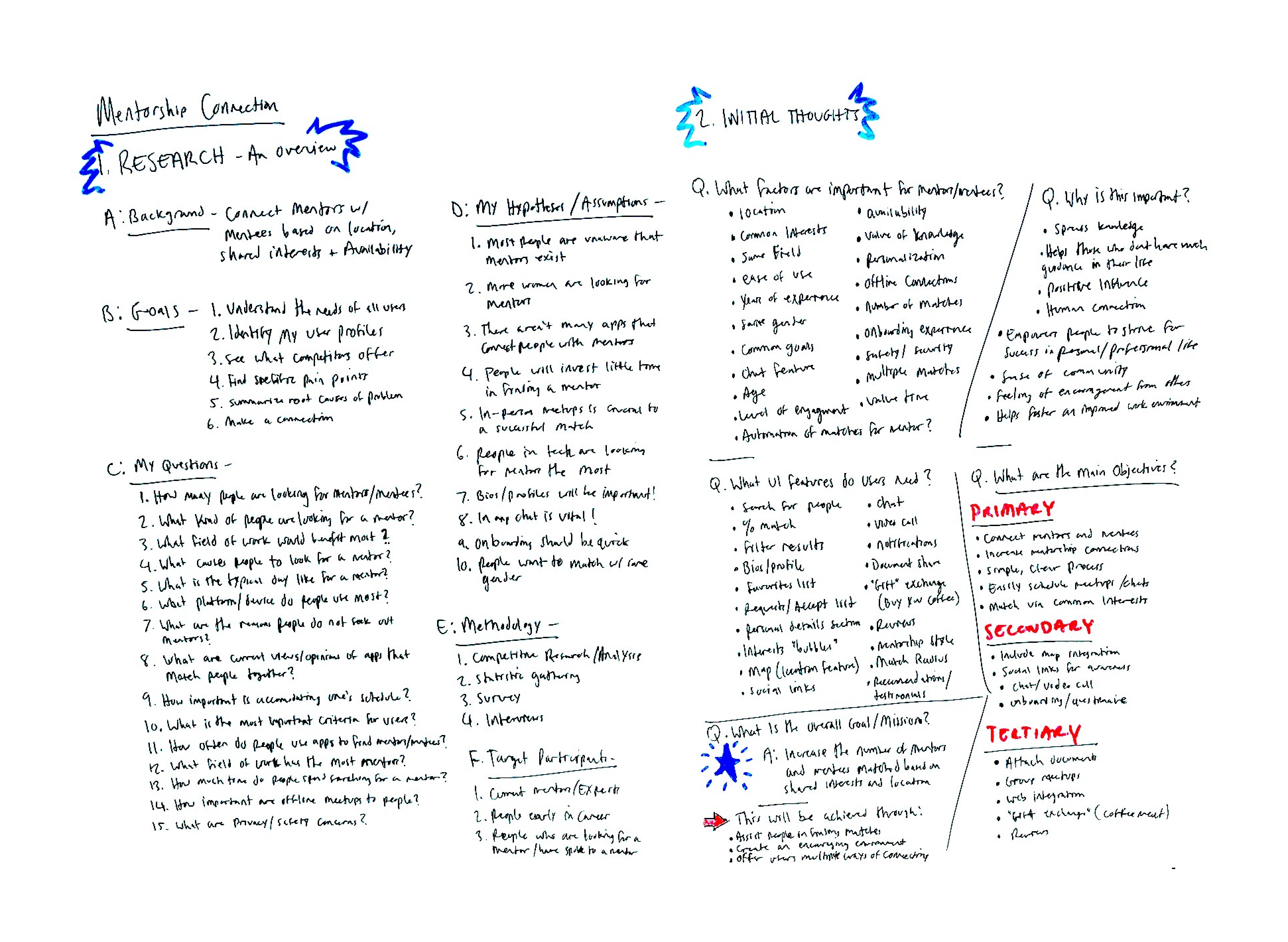
Statistics
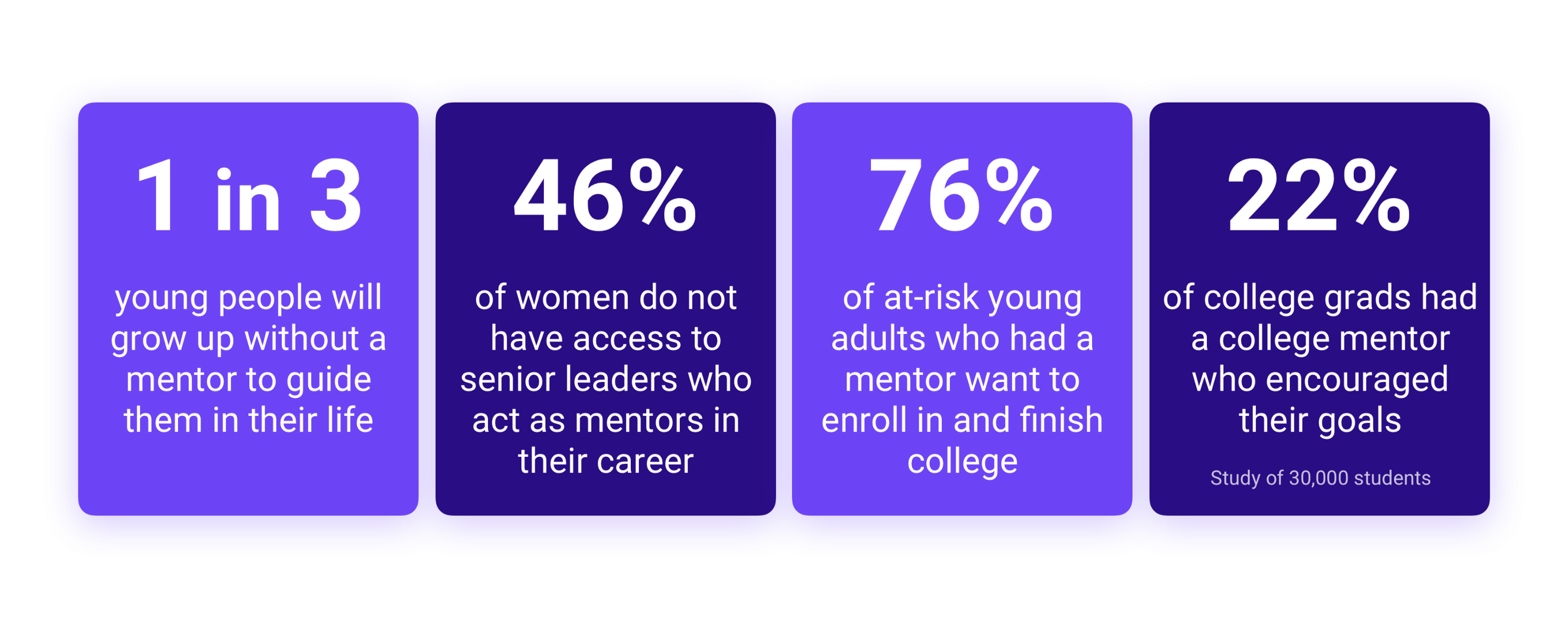
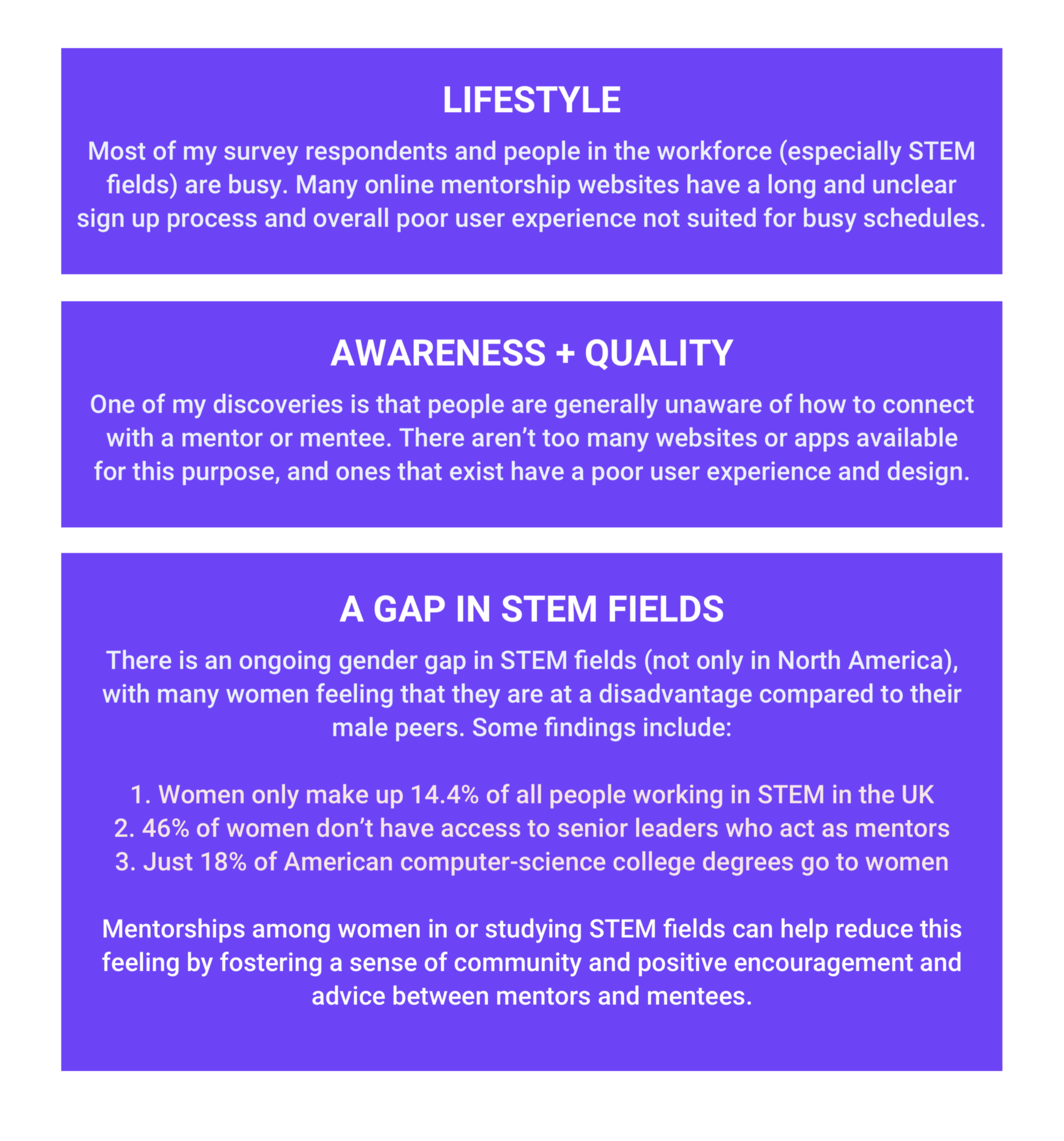
It was critical to understand early on which groups of people are looking for mentors most and how much of an impact mentorship has on people. The following statistics confirm some of my initial hypotheses and assumptions, and also highlight the need for designers to start designing products and experiences that assist in connecting mentors and mentees in an easy and efficient way.
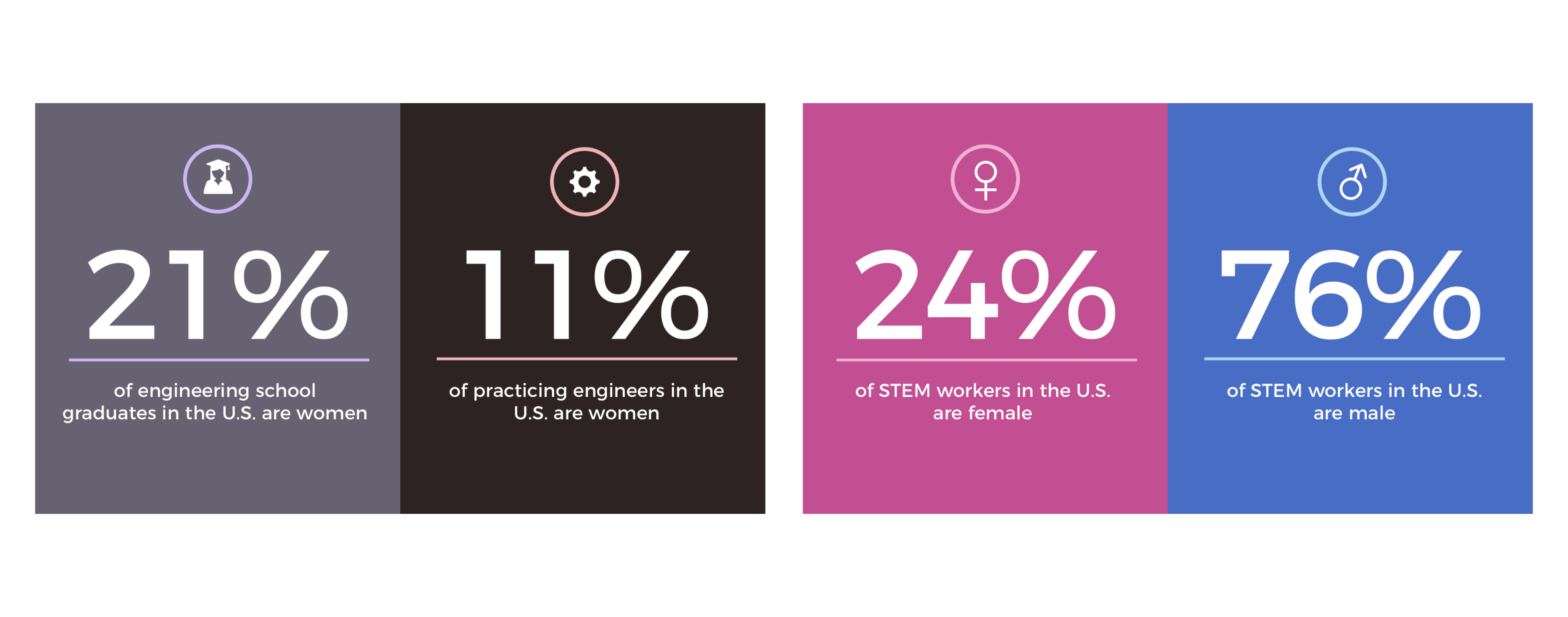
One of the most interesting discoveries is that women have a much tougher time connecting with mentors, especially in STEM industries. The following statistics communicate the need to empower women in STEM and provide them with mentorship and support.
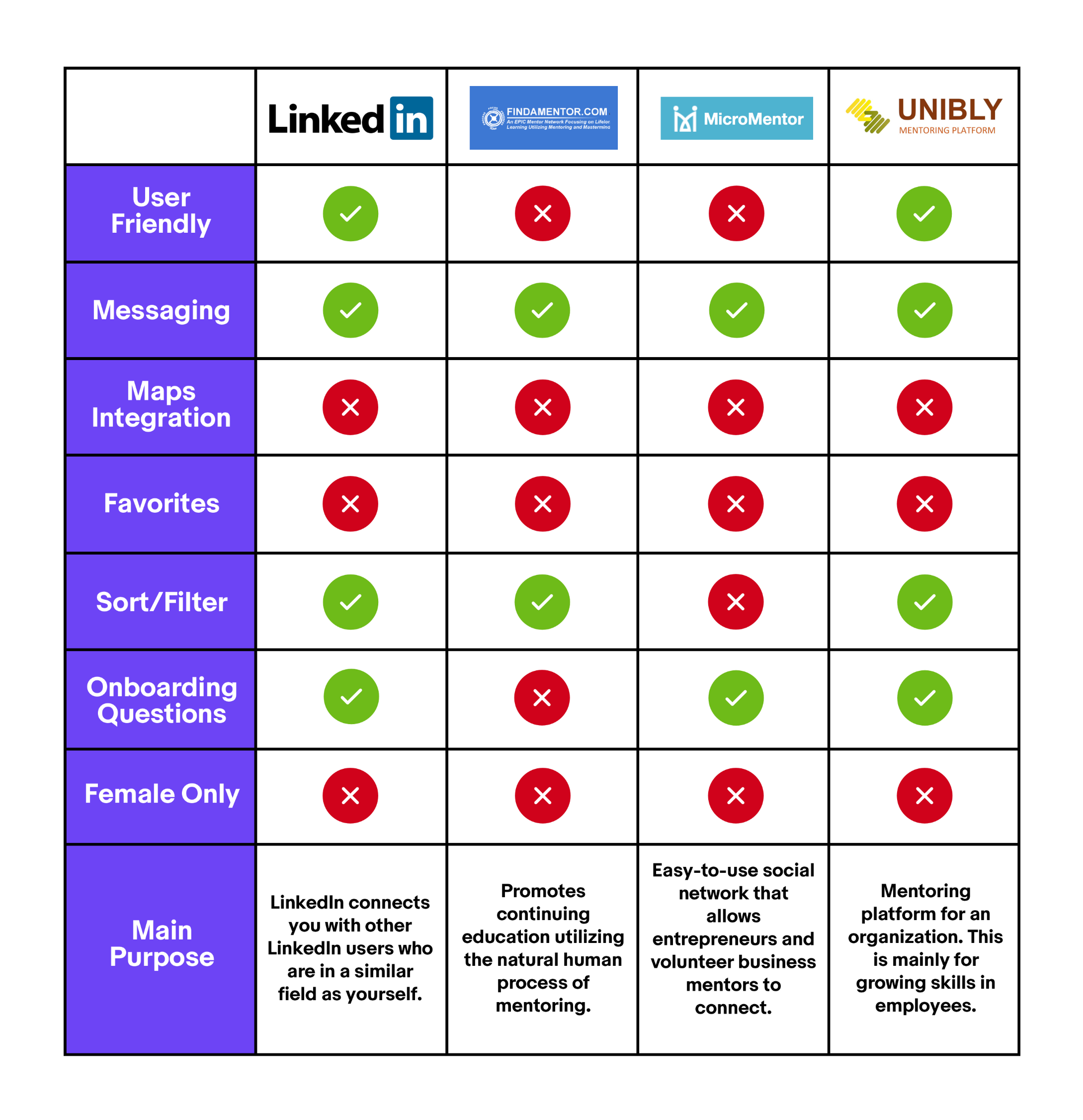
Competitive analysis
I kept my competitive analysis general and focused on features, functionality, main purpose, reviews and general usability. This allowed me to assess competition and identify areas where Doyenne can have a competitive advantage. I quickly found that there are few mobile apps for connecting with mentors. This provides Doyenne with an opportunity to set the standard for mentoring mobile apps, and will be one of my constraints for this design exercise. *At this stage I did not limit myself to strictly female mentorship platforms as I needed to validate and assess several of my assumptions and hypotheses.
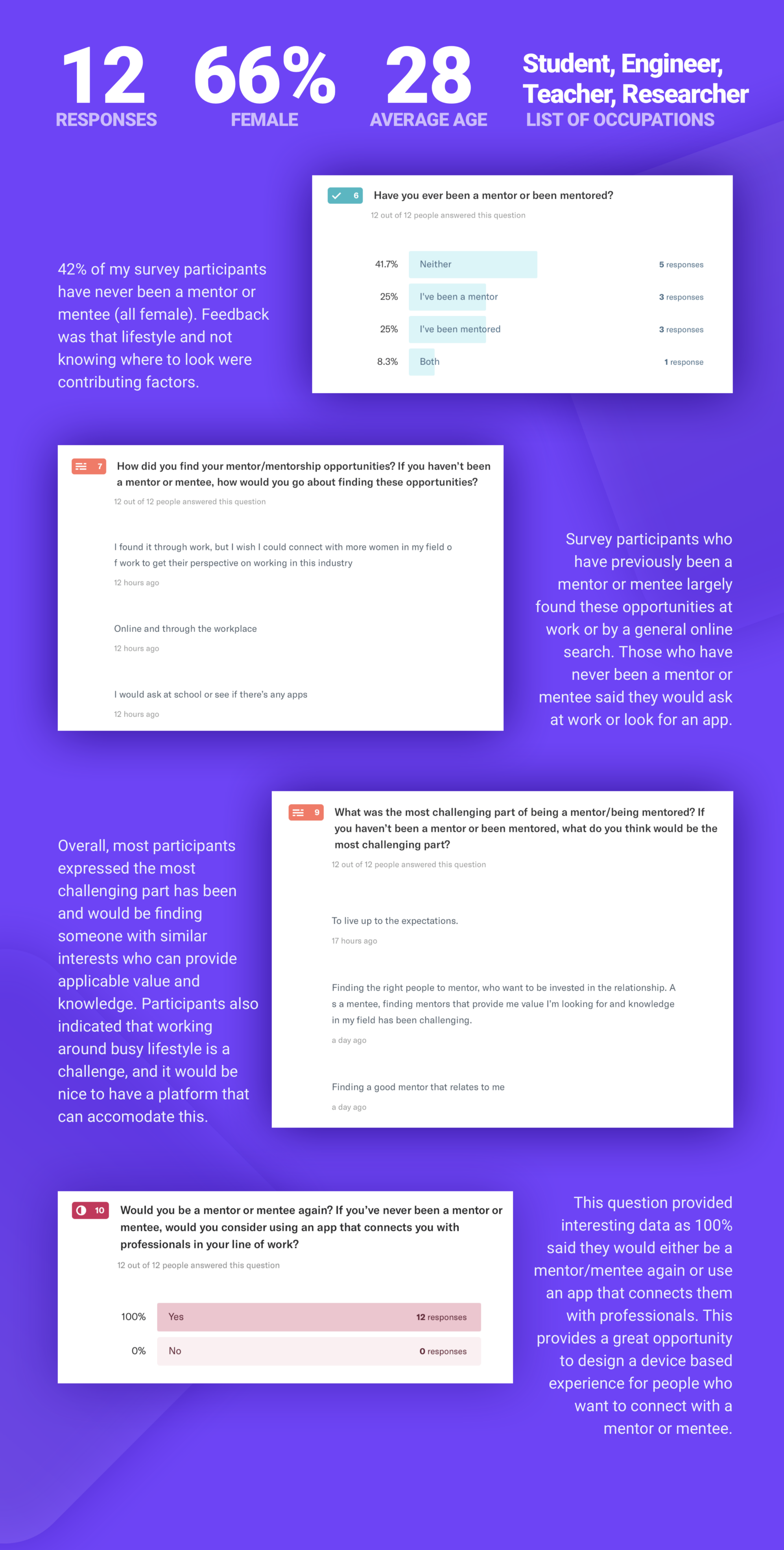
Survey
Using data to support design decisions is an important part of my design process. Both qualitative and quantitative data is useful for understanding user goals, pain points and lifestyle in order to tailor the user experience. For this design exercise, I gathered both types of data to understand what is happening and why it is happening.
Identifying the problem 📝
The research and data collection up to this point suggests that people not only have trouble finding a mentor or mentee, but also experience challenges being matched with a good mentor or mentee. This is problematic because having a mentor to provide advice, guidance and encouragement has been shown to produce personal and professional benefits.
Throughout my research I identified a pressing problem that will be the focus of my mentorship connection experience: approximately 50% of women leave their jobs in STEM fields early, often because they don’t have a mentor for guidance and advice.
Below is an overview of my main discoveries from the initial research phase:
Problem Statement
Women often experience challenges finding and building meaningful connections with female mentors, especially in STEM careers.
How can we provide these women with the support and encouragement needed to achieve their personal and career goals, while building a feeling of community and empowerment?
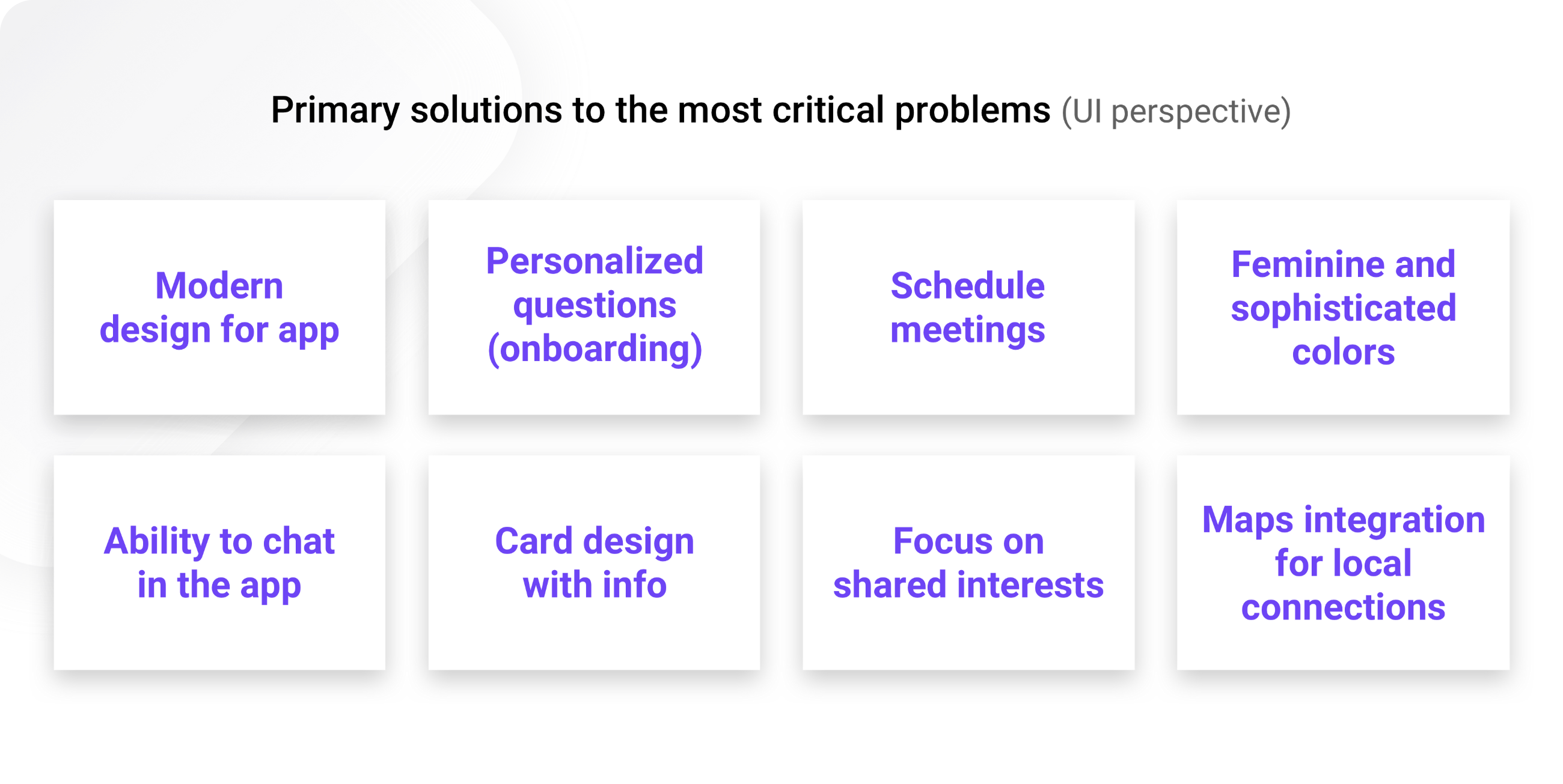
Solving the problem 👍
With these things in mind, I decided on the following mission: Connect more women mentors and mentees in STEM fields.
The ultimate goal of my experience is to help females early in their careers connect with professionals in STEM fields. How this will be achieved:
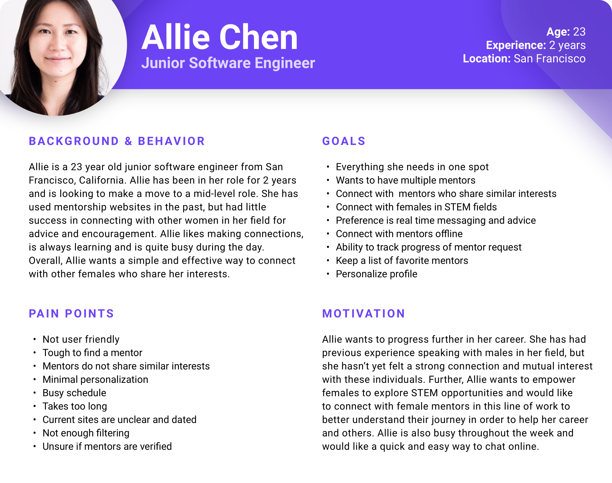
Who are we solving for? 👱
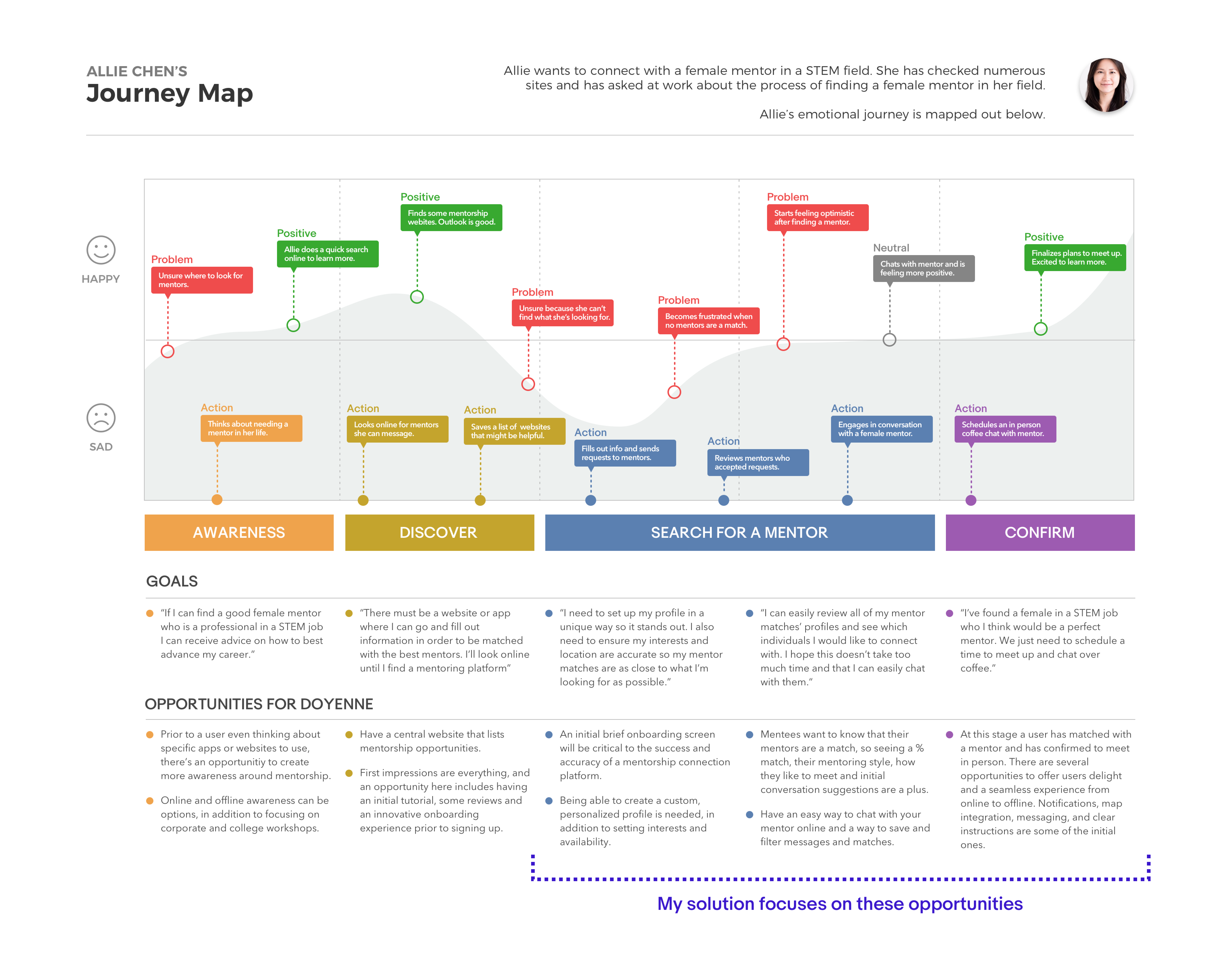
Allie Chen: a 23 year old junior software engineer looking for a female mentor
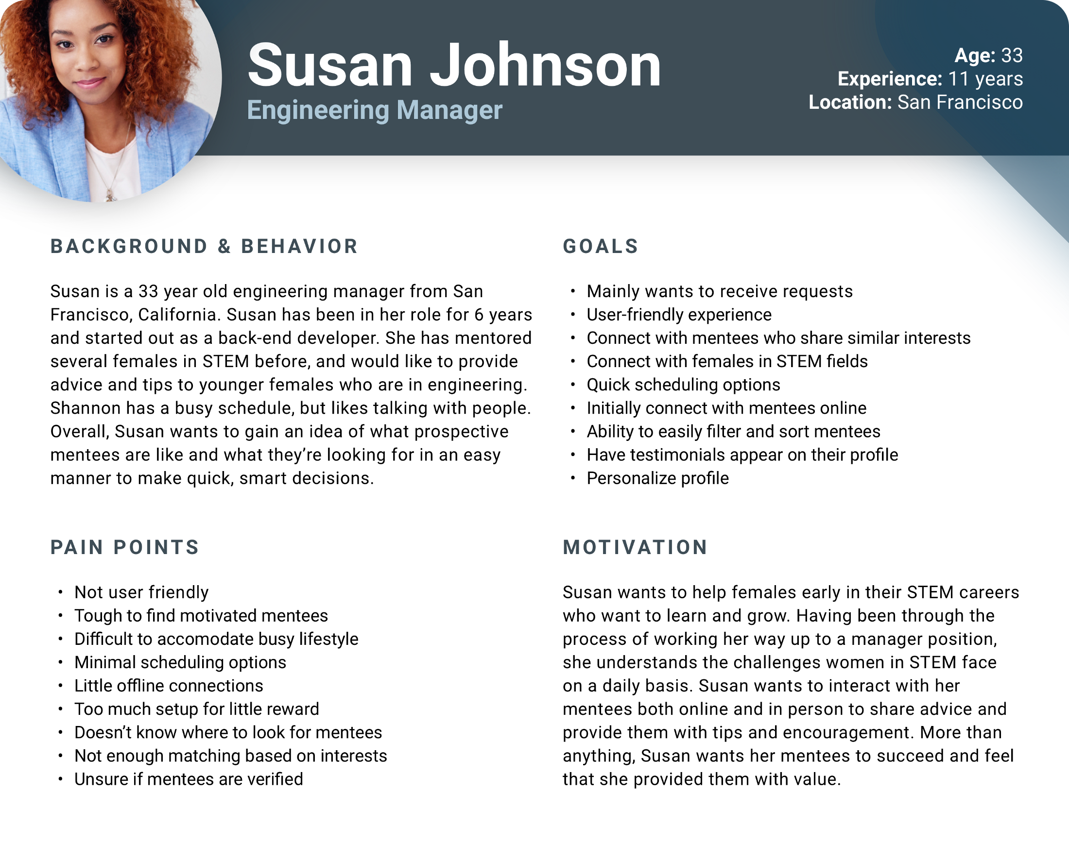
Susan Johnson: a 33 year old engineering manager looking to mentor younger females in STEM
Journey Map and User Flow 🗺️
Empathizing with Allie and understanding her previous experience in finding mentors is important to designing an experience that alleviates her pain points and helps her achieve her goals. The following is Allie’s journey and emotional experience through connecting with a mentor (Note: This is her current experience with existing sites and apps).
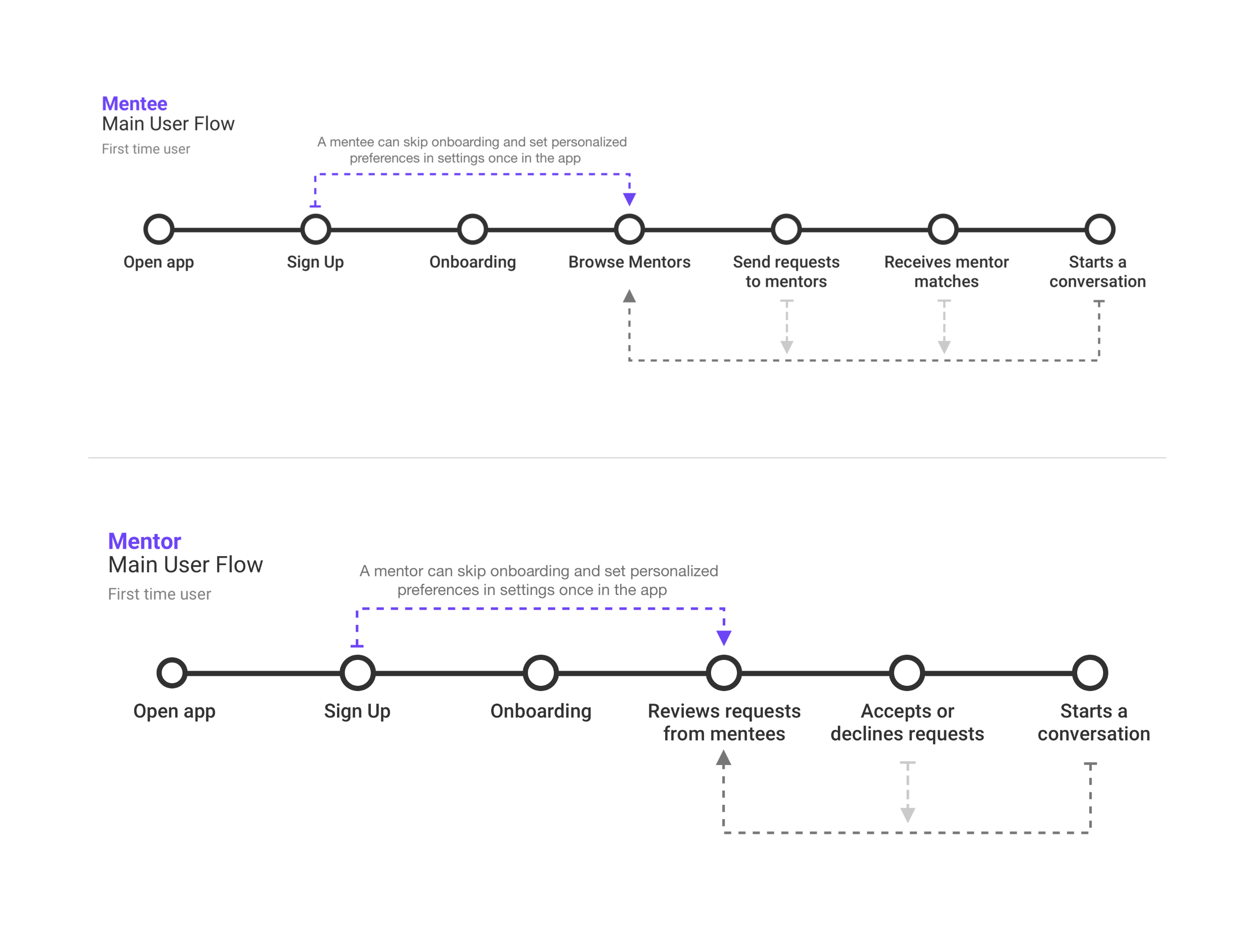
To visualize the user flow for Doyenne’s two primary types of users, I created two streamlined user flows that outline the primary journey when using Doyenne for both mentees and mentors:
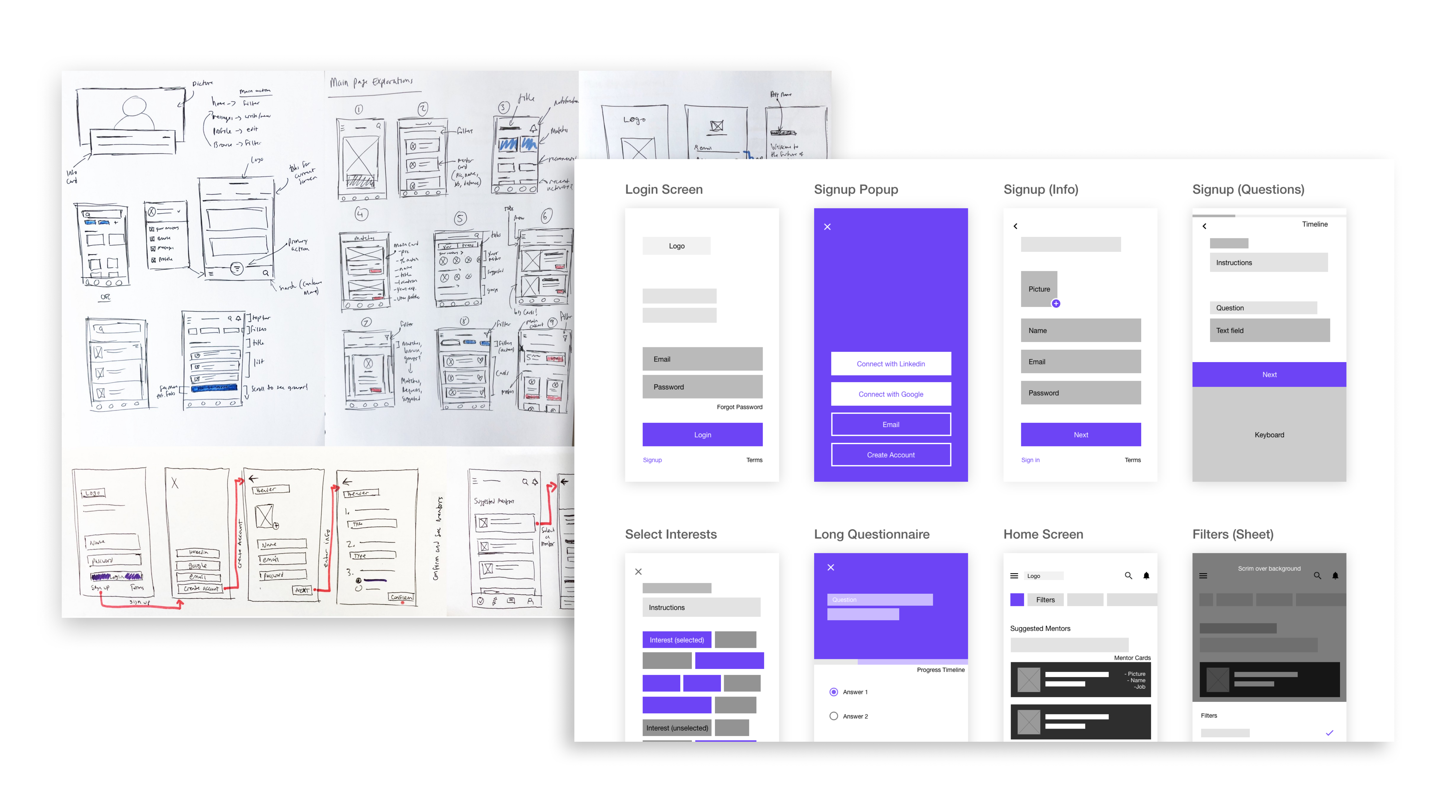
Sketches and Wireframes 🖊️
At this point, I had a clear understanding of the features the app should contain, the actions Allie and Susan will take while using Doyenne, and how to best address and alleviate user pain points through design. I was able to start sketching the main user flow and several other ideas for various screens. My goal here was to visualize the user interface, user interactions and flow of the app.
Inclusive design 💛
Part of making my app accessible is through color. All of Doyenne’s colors surpass W3C’s level AA requirement of a contrast ratio of at least 4.5:1 for normal text and 3:1 for large text. For users who are color blind and/or view this content in monochrome, links will have a caret at the end indicating a link (another solution is to have all links underlined by default). Here are some additional ways my app sets the bar high for accessible design:
- A clear hierarchy of importance and visible elements are clear
- Text, strokes and indicators are used to describe content and actions (Example: text field error state)
- 48 x 48dp touch targets, with 8dp or more space of separation
- Writing is clear and succinct
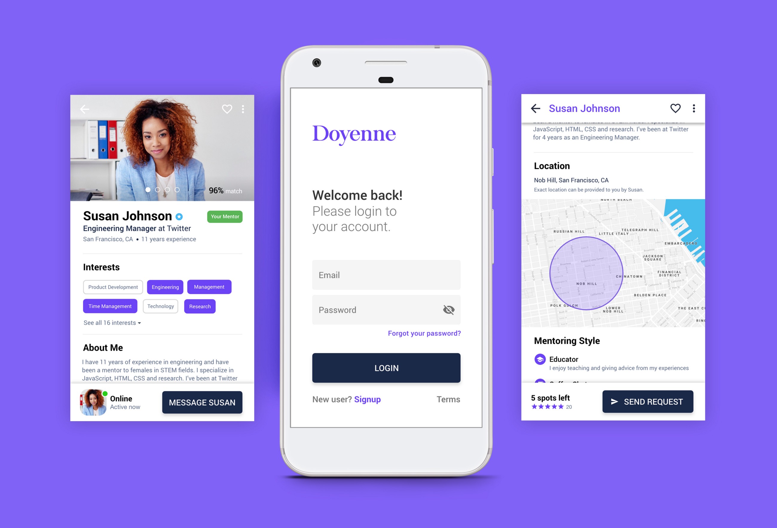
Welcome to Doyenne 🎉
Doyenne is an app that matches mentors and mentees. The key differentiator is that mentors and mentees are suggested based on shared interests, location and availability. Personalized onboarding, customized profiles and the ability to verify one’s profile ensures that users find the best match possible.
About the name
Doyenne means “a woman who is the most respected or prominent person in a particular field.” This is a perfect fit because the name is feminine but strong, and represents the main goal of my app: Connect females with females who are leaders in their field.
First time user 👶
Logging back into your account or signing up for a new one should be quick and simple. If you already have an account, I implemented a one click login. Alternatively, I also designed a login screen that uses filled text fields. While more traditional in design and function, it does require additional user effort and can result in a pain point for some users.
Login (Video)
In Allie's scenario, she needs to create an account. The initial screen asks for her name, email and password. I also decided to have Allie upload a profile image at this stage to build trust, reduce long-term friction and to have an improved profile visual.
Once an account is created, Allie is asked to answer 4 brief questions to assist Doyenne in finding matches. These questions relate back to our goal of matching mentors and mentees in STEM roles based on similar interests and location. Users can also be university students and answer “What is your occupation” by saying that they are a student.
Create Account and Onboarding (Video)
After Allie has created an account, she receives a view with an artificial loading skeleton screen. This is to increase the perceived value of the product and communicate to Allie that the app is working on providing her results.
Skeleton Screen (Video)
Primary user flow: Mentee requests a mentor 🤝
The following prototype shows the end to end flow of a mentee searching for a mentor and a mentor reviewing and accepting the request.
Full end-to-end user flow (Video)
Bottom navigation
I chose bottom navigation as the primary navigation for this app (secondary is the navigation drawer) because there are minimal top level views. I also chose bottom navigation when thinking about reach navigation and the various potential users of Doyenne. For example, some users might be commuters who can only use one hand, or someone with a physical disability where accessing the top half of their phone is challenging.
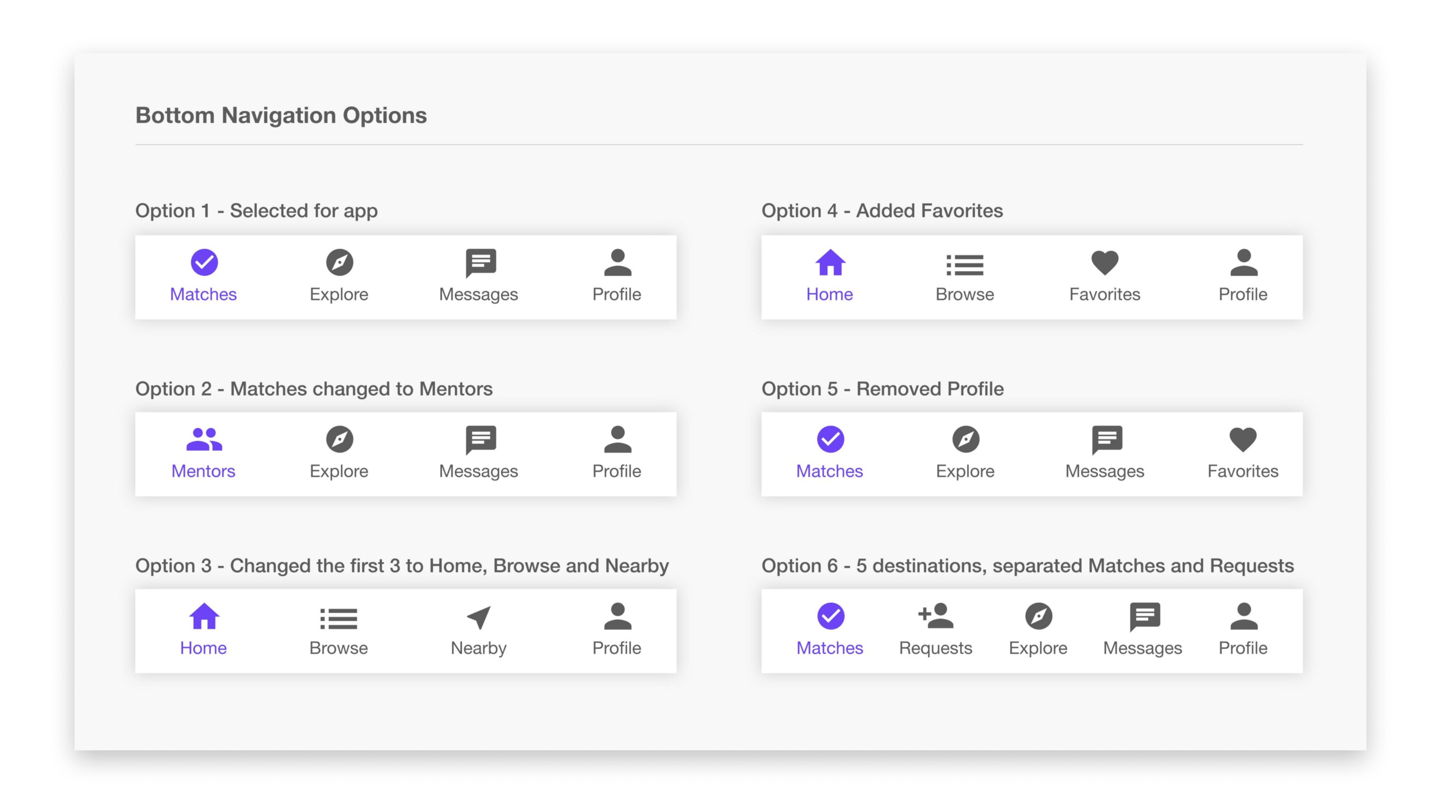
I designed and tested 6 versions of the bottom navigation bar, with each version displaying a different set of app destinations. After asking for direct user feedback on which pages are most important for quick access, the final version includes the following 4 views:
- Matches
- Explore
- Messages
- Profile
Each tab represents a different part in Allie’s journey towards matching with a mentor and engaging in meaningful conversations with them. Let's take a closer look at my design decisions for each section.
Matches ("The Homepage") 🏠
The matches screen initially focuses on Allie’s suggested mentors. Mentors are listed in order of how much of a match they are to Allie. The final design for the matches page is displayed below. This is the first screen displayed after Allie creates an account and answers the initial questions.
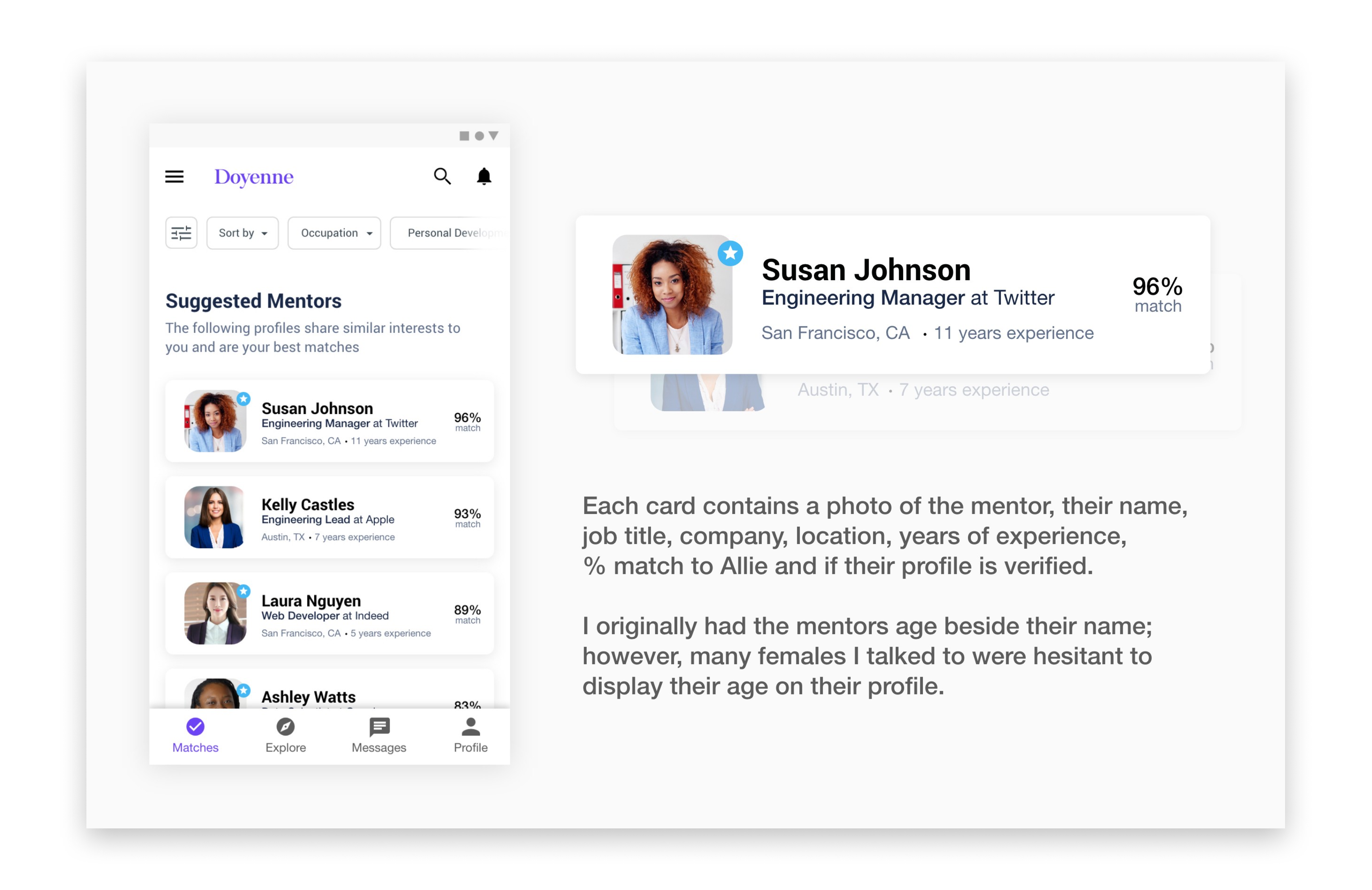
If a user clicks on one or more mentor images, the card become selected, the top app bar transforms into a contextual action bar, and Allie has the ability to request, favorite or delete the selected mentors.
Select multiple cards (Video)
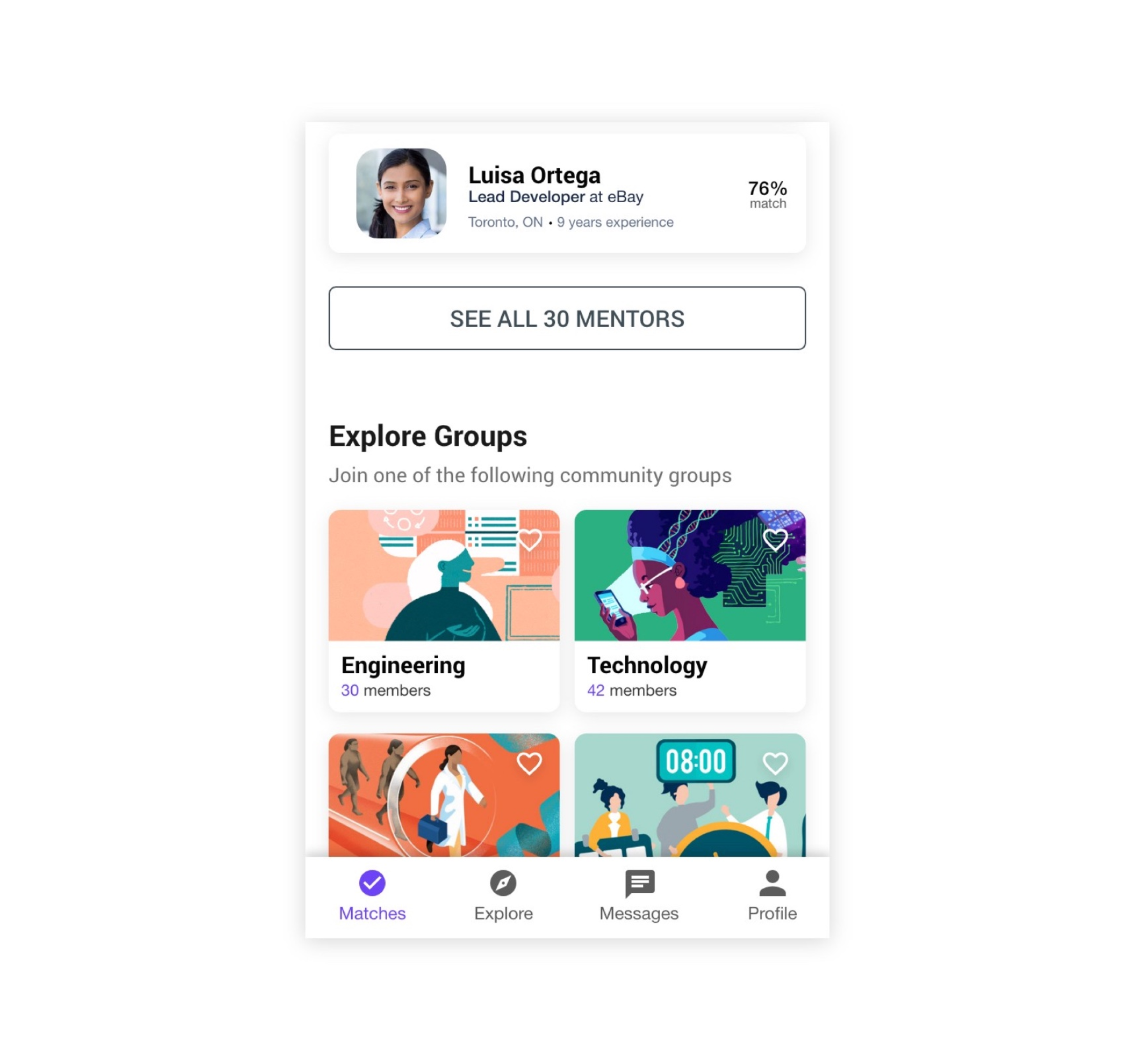
I have the maximum number of mentors shown on the homepage set to 5 for a lower cognitive load. If there are more than 5 suggested mentors, a “See All Mentors” button appears below the content. If a user continues scrolling down the homepage, they will see an “Explore Groups” section. Since building community is one of Doyenne’s goals, Allie can join several groups within the app to connect with other users.
Above the cards are filters. Allie can perform a horizontal scroll to reveal more filters, or tap the first filter icon to see a sheet displaying all filters. Once filters are applied, the homepage will update with new results. The thinking here is giving Allie easy access to filters so she can view and connect with the best mentors possible. This not only includes filtering by interests, but also incorporates location, availability, occupation, job title, ratings and more.
Filtering on the homepage (Video)
Sort by filter (Video)
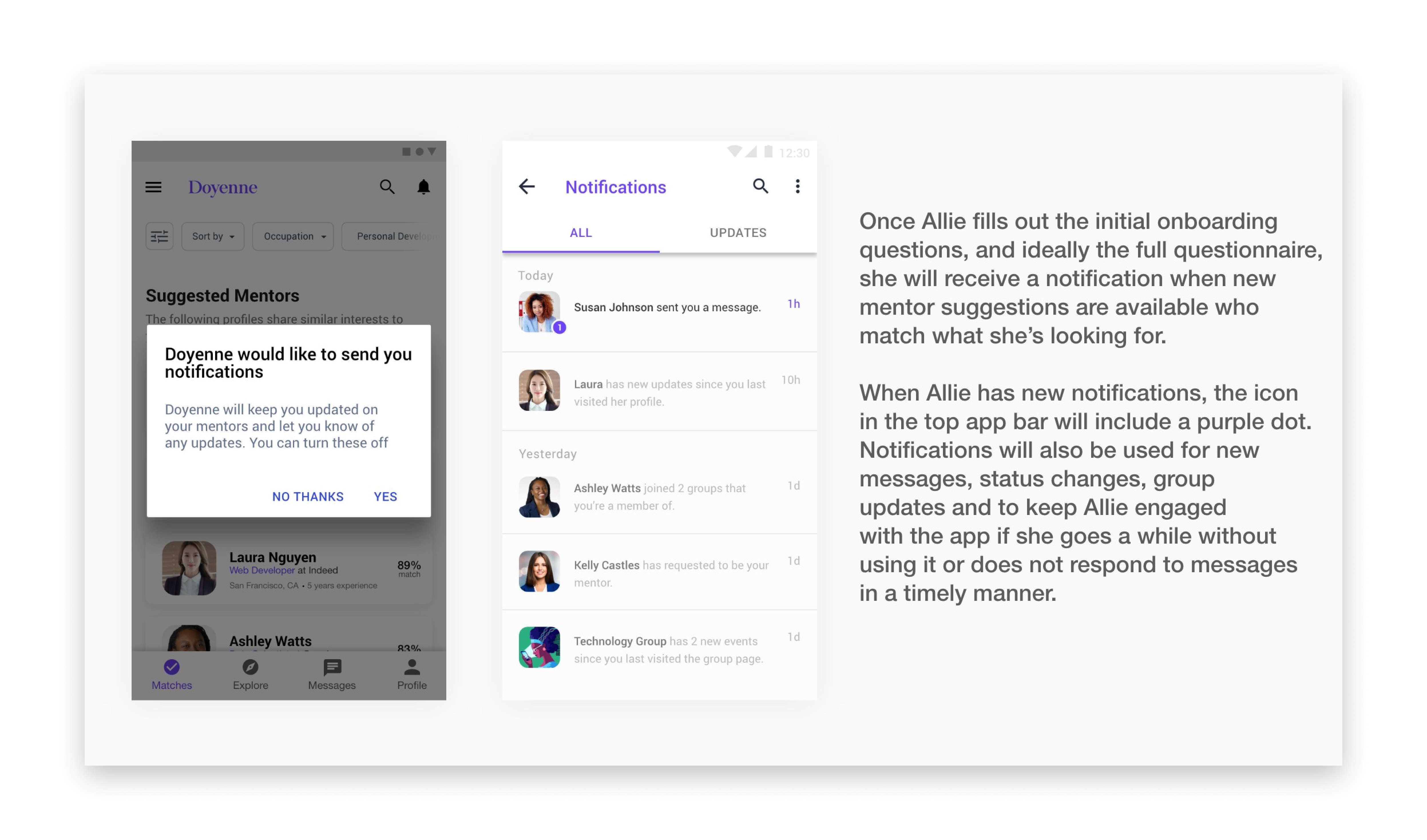
Lastly, Notifications is something that many apps overlook, though are very important to Allie’s experience with Doyenne.
Explore 🧭
The explore view is fairly simplified and focuses on discovery and filtering. While the Matches page provides curated matches that are a best fit for what Allie is looking for, the Explore page provides Allie with all mentors and groups who are using Doyenne.
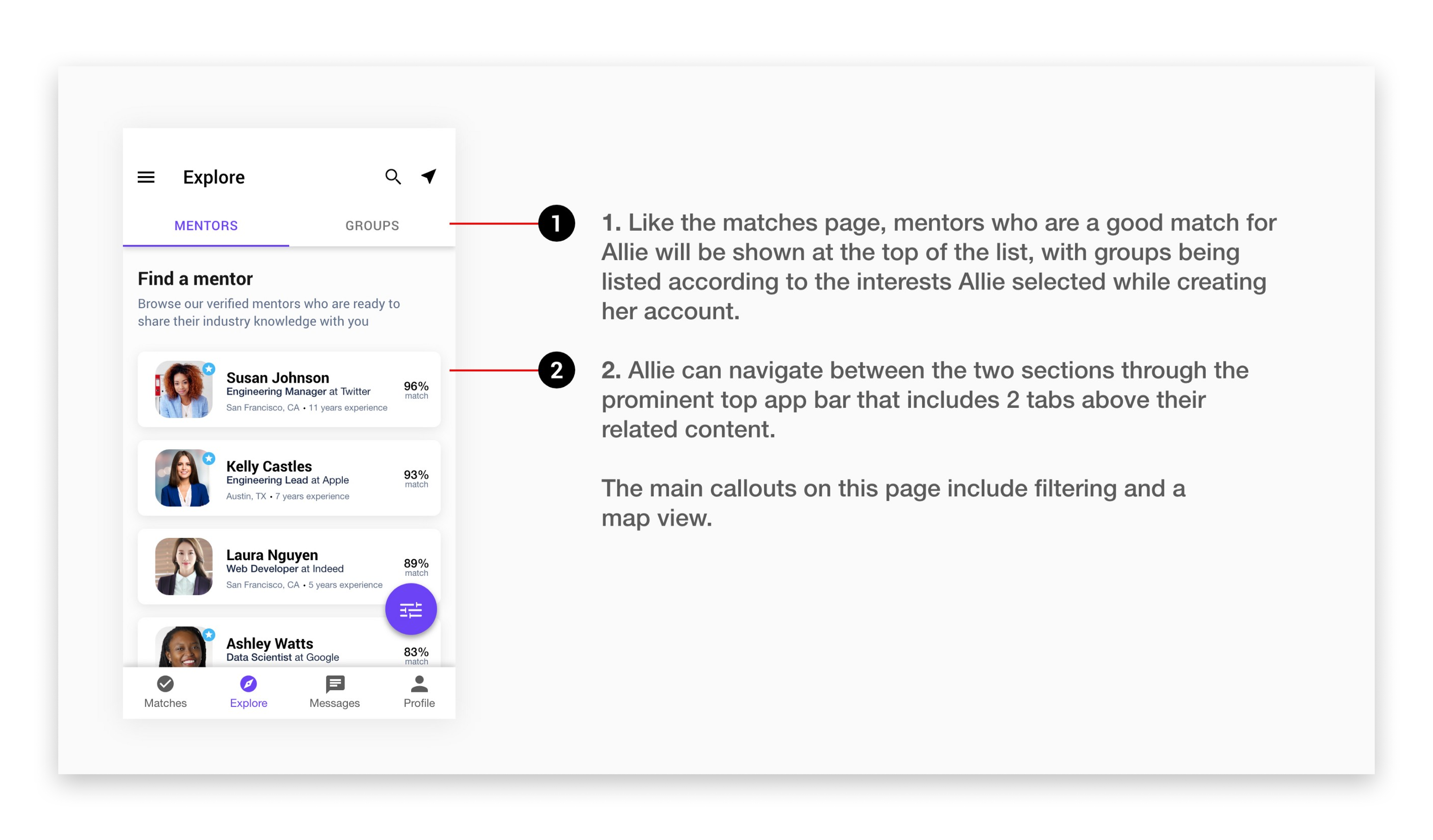
I’m using a FAB for filtering on this page because it is the most suitable way to present the Explore page’s primary action. On the matches page, a maximum of 5 mentors and groups were displayed at the same time. Thus, filtering was not a primary action and did not need to be used as a FAB. Since there can be instances where hundreds of mentors and groups are displayed in one long scrollable list, filtering becomes the primary action as it reduces friction for Allie and helps with her pain point of discovering the best matches for her unique needs.
Filter button - Updating results animation (Video)
Through my initial research, one question I asked my survey participants was “How important is it to find local mentors?” The feedback I received was that finding mentors nearby was not a primary need due to busy schedules and a hesitation to meet mentors in person without any prior contact. With this feedback, I included a near me icon in the prominent top app bar. If Allie clicks this icon, she is presented with a map that shows her location and the location of mentors nearby. Users can filter their results, search locations or mentors, change their location (if necessary) and easily view the profiles of local mentors.
Explore - Map view (Video)
Messages 💬
Communication between mentors and mentees is central to the success of Doyenne and to the success of supporting and empowering Allie and other women. As mentioned, I tested 6 versions of the bottom navigation bar, with 2 that did not include messages as a primary destination in the app. In those 2 versions, I found that discovery of messages was an occurring pain point as I had it contained within Allie’s profile page.
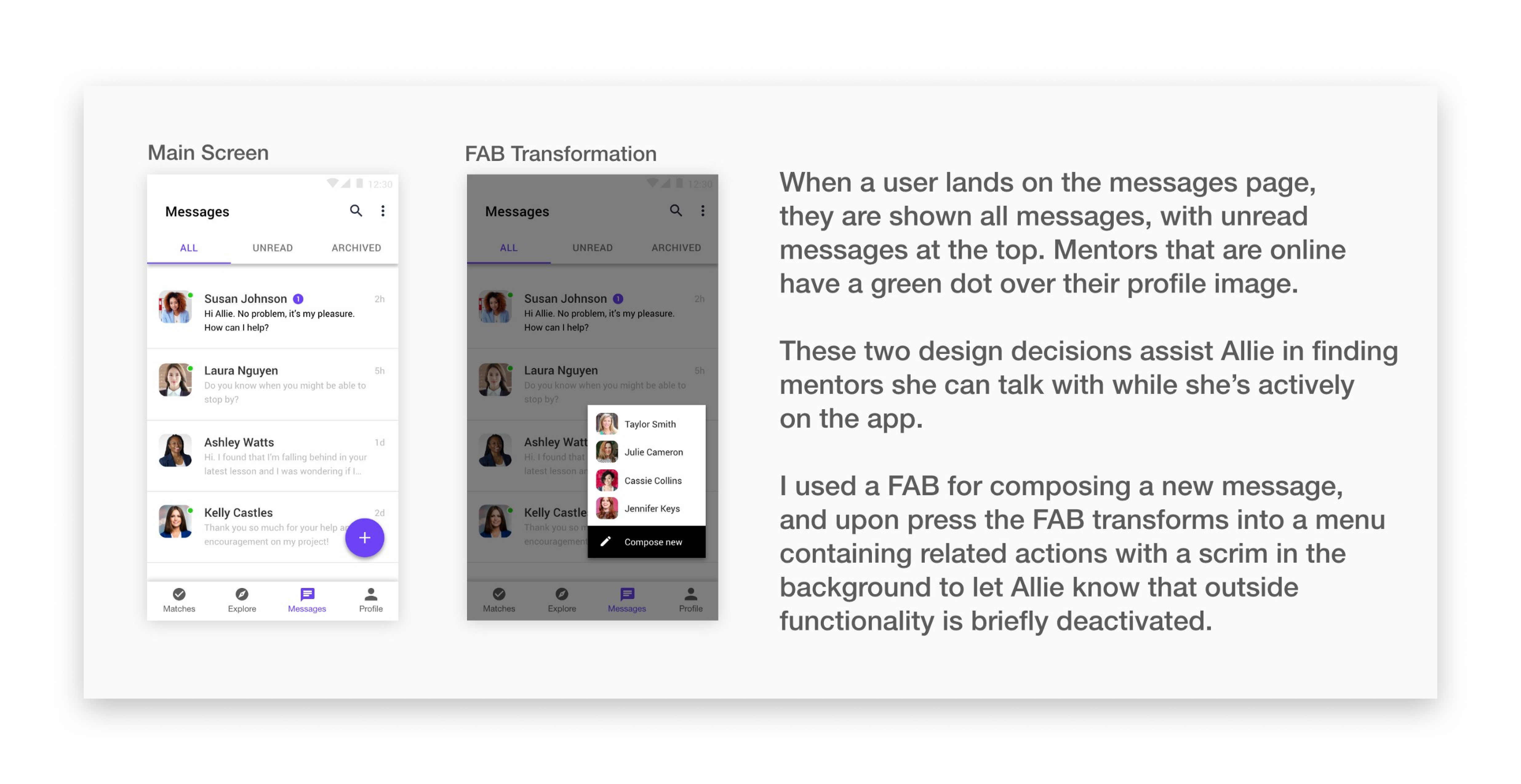
Actions and functionality in the messages section of Doyenne were selected to ease some of the pain points Allie and others experience (Pain points include inability to share documents, no video calling, minimal filters and many steps to compose a new message). In addition to general chat based conversation that has speed and efficiency in mind, the ability to video call is provided if an in person meetup is not feasible. This still provides both mentors and mentees with the human element, and allows each other to pick up on body language and shifting emotions.
Further, if a mentor wants to schedule any type of communication with their mentee (for example, a coffee chat), they can access this option through the overflow icon in the top right corner. This scheduled event will appear in the chat.
Send an invite (Video)
Profile 👩
Arguably the most important section of Doyenne, the profile page is where I spent much of my time designing. For mentees like Allie, it allows her to learn more about potential mentors and provides all necessary information to allow for informed decisions on which mentors to request. For mentors, they are able to review a prospective mentee’s profile to learn about their interests and background. Just as mentees can request mentors, mentors are able to browse mentees and request to mentor them.
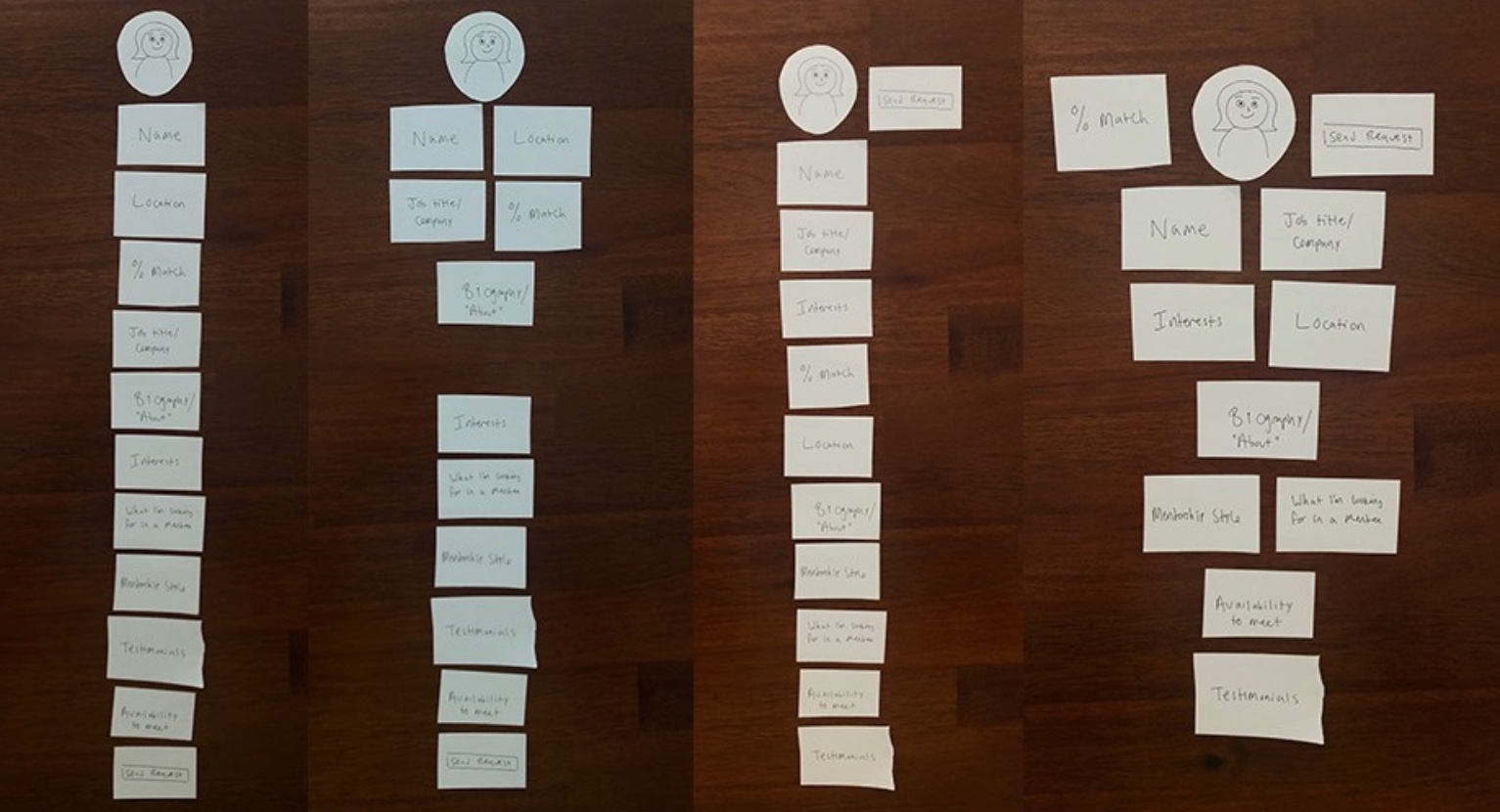
One of the challenges I faced was prioritizing information shown on profiles so users can quickly read through to decide whether the mentor or mentee is a good fit. The design of the profile page was determined through my competitive analysis and an activity I presented 5 potential users. To validate what information is most important on a profile page, I created a disassembled profile page and asked each potential user to assemble a profile page that would provide them with the most value.
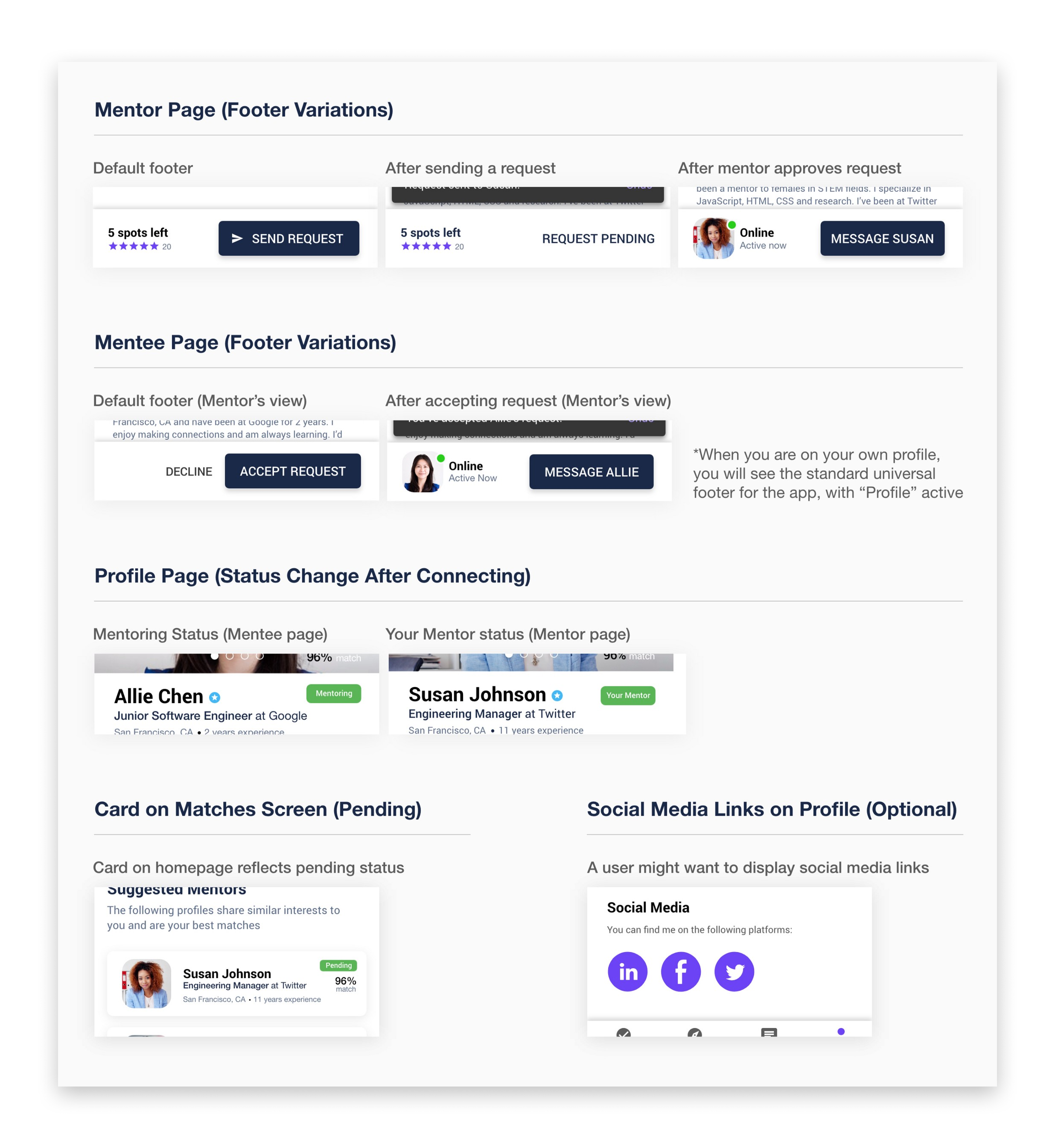
Depending on when a mentor or mentee is using Doyenne (i.e. first time user, request sent, request pending, request accepted), profiles will appear slightly different. I will be focusing on Allie being a first time user browsing Susan Johnson’s (a mentor) profile. Subsequently, I will show what Allie’s profile page looks like to a mentor and the different variations of the profile page.
The mentor profile (Susan)
Mentor profile prototype (Video)
A concern some potential users raised to me during the research phase was profile and user authenticity. Since anyone with a valid email address can create an account, and the intended audience for Doyenne is females, verifying your account is a top priority. This will follow the user flow that apps like Bumble use. Once verified, a blue badge with a star is displayed beside their name. Shared interests provides Allie insight into topics she and potential mentors have in common. When a mentor creates an account, they are also asked to select interests.
The "About Me" section allows users to add personality and thoughtfulness to their profiles, and it helps to differentiate users from other profiles and establish credibility and trust. Further, Doyenne is a global app, and females who live anywhere in the world can create an account to connect with prospective mentors and mentees. Although, there are scenarios where local coffee chats and in person meetups are preferred. By default, availability will not be displayed until a match is made. This is because it makes most sense to display availability to a mentee and mentor who are matched and will be communicating more frequently, in addition to some privacy concerns from a mentor's perspective.
The mentee profile (Allie)
A mentee’s profile appears fairly similar to a mentor’s profile, with some differences that I’ve highlighted below.
To reduce friction of getting into the app, I decided to keep verifying your account and the full questionnaire until after you have created an account. This will appear as a status bar at the top of a mentee’s profile.
Profile progress (Video)
Once Allie is connected with a mentor or joins a group, the homepage of the app will show her mentors and groups first, followed by an outlined button to explore other mentors and groups. Suggested mentors will now appear in the explore section of the app, with the highest matched mentors appearing at the top of the list. One important thing to note with finding mentors and requesting them to mentor you is that a mentee can have multiple mentors at once. For example, if Allie wants mentoring on career progression, personal life, a project she can openly discuss, or about one of her hobbies, one mentor might be unable to provide expertise in all of those areas.
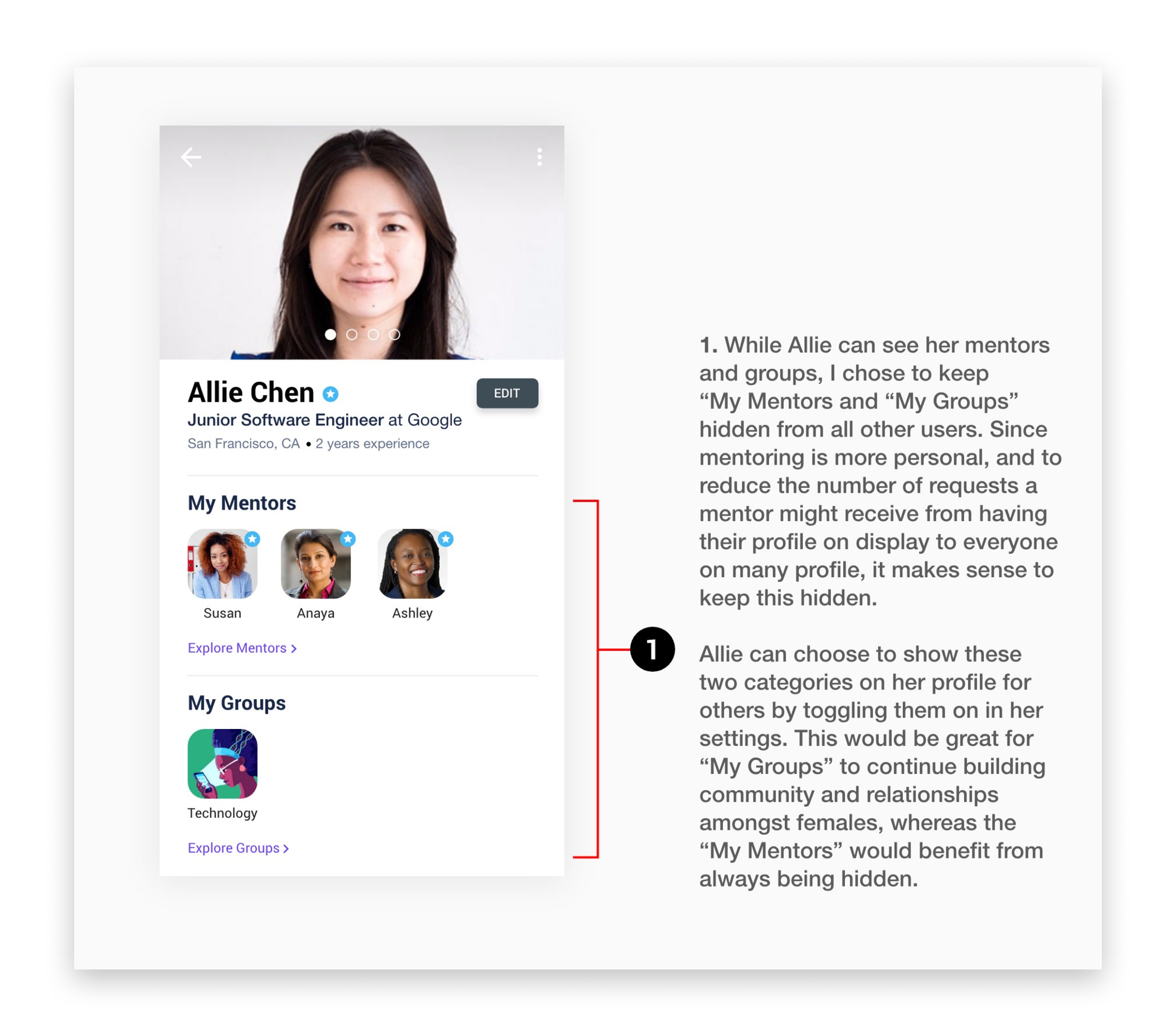
Profile page variations
Depending on the part of the primary user flow a mentee or mentor is at, elements on profile pages will appear slightly different.
Group Page 🧑🤝🧑
With mentoring being kept to a mentor/mentee relationship, a feeling of community is often missing from a mentee’s experience in using mentorship websites and apps. A question I asked my survey participants was: “Would you consider joining a group that held discussions and events on topics you’re interested in?” All of my respondents answered yes, which led to the creation of group pages.
Group page (Video)
Measuring Success 📈
If I had the opportunity to develop and release this application, these are the ways I would measure its success and the effectiveness of this proposed experience:
- Increase in matches between mentors and mentees
- Longer sessions with mentors
- Onboarding and Questionnaire completion rate
- High number of users joining groups
- Number of video calls and coffee chats scheduled
- Low number of uninstalls
- Increase in mentor referrals
- Direct user feedback
- Positive messaging between users
Takeaways + What would I change? 💡
This case study has covered my approach to solving the problem of connecting mentors and mentees based on unique requirements. Early on, I identified a few problems that I focused on solving through an improved experience for mentees and mentors. These include current mentorship platforms having a poor overall user experience, lack of personalization, long and unclear sign up process and dated designs. My research also communicated a gender gap in STEM fields and a general difficulty for women finding a mentor and feeling encouraged in the workplace.
Doyenne solves these problems and many others in a number of ways. Initial onboarding gets to know the user, understands their interests and provides them with immediate mentor suggestions based on how well of a match they are to each other. Personalized profiles not only give a human element to Doyenne, but provide trust and authenticity. Including chat, video calling and community groups allows mentors and mentees to build relationships, stay connected and easily receive advice and tips from mentors and other members. Lastly, with a focus on females in STEM fields, Doyenne plays a role in empowering women and provides them with a space to seek advice when needed.
The following are specific areas of focus for a future iteration of Doyenne:
- Look at using a different bottom navigation
- Consider implementing loading animations to keep users engaged and build trust
- Create a more balanced UI that is equally centered around professionals and students
- Make it more inclusive so any users of any gender and profession can be a member
- Swipe design to continue simplicity in design
- Design for different users since not every user is going to use an app in the same way and for the same reasons
- Design for multiple devices and platforms, not just mobile
You've reached the end of this case study!
If you made it this far, thanks so much for reading through this case study! While this was a concept project, I believe Doyenne can be a leader in continuing to grow female mentorship, and I hope this case study has inspired you to invest and support mentoring.
Want to see more projects? Click one of the links below:
Next: "LinkedIn" - Jobs on Flagship
Previous: "eBay" - Returns on eBay