Transforming LinkedIn Hiring for Small Business Owners
Faced with the complex and costly hiring tools on LinkedIn, small business owners struggled to find the right candidates efficiently. To address this, I embarked on a user-centric design journey, immersing myself in the recruiter's world. Through extensive research and collaboration, I developed a simplified, mobile-first hiring experience that seamlessly integrated with LinkedIn's existing platform. This solution not only streamlined the hiring process for recruiters but also delivered significant results, including a 60% increase in successful hires and a 185% increase in candidate communication.
LinkedIn's Hiring Hurdles: A Small Business Owner's Struggle
Kathy, an experienced recruiter, finds LinkedIn's complex and expensive hiring tools ill-suited for her small business needs. With less than 20 minutes a day to dedicate to hiring, she needs a simple and free solution, unlike LinkedIn's legacy Recruiter product, which 40% of users struggle to find and use.
The platform's lack of integrated job posting and applicant management on the main site, along with the absence of a mobile solution (despite 85% of small business owners expressing interest), force her to use competitors like Indeed. This disjointed experience further complicates her already time-constrained hiring process.

Designing with Empathy to Build Better Tools
To create better hiring tools for LinkedIn, I immersed myself in the world of recruitment. I asked key questions, exploring how to seamlessly integrate job and candidate management, simplify the hiring process, and make life easier for recruiters.
I also tested competing products, interviewed hiring managers to understand their pain points, analyzed data from LinkedIn's existing hiring product, and brainstormed solutions with a cross-functional team.
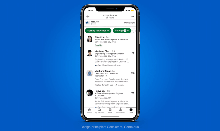
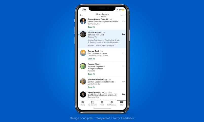
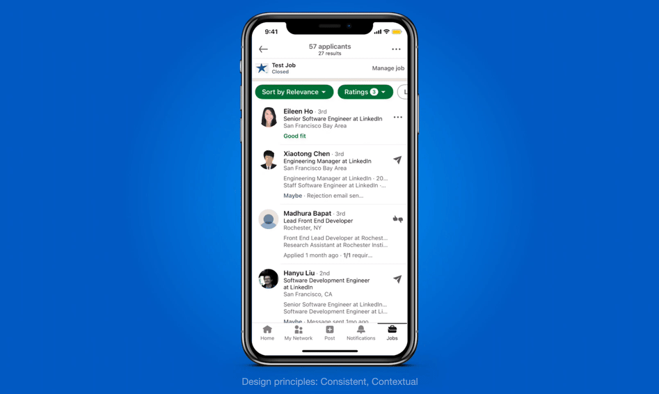
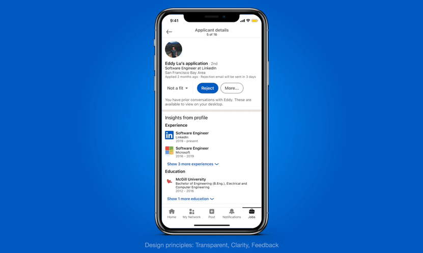
User-Centric + LinkedIn-Aligned Guiding Principles
To ensure a consistent and user-centered approach, I established product and design principles that aligned with LinkedIn's goals, guiding my team and others throughout the design process:
Product 💻
Keeping it simple, integrating seamlessly with LinkedIn, and prioritizing the needs of the majority.
Design ✏️
Being consistent, transparent, and providing clear, contextual feedback.
Designing with Purpose through Insights and Iterations
My design approach started with sketches inspired by research and design principles. I focused on mobile-first, applicant card layouts, swipe gestures, and filtering options.
A key challenge was designing for diverse users and entry points, so I meticulously mapped out user flows to ensure a seamless experience.

To streamline my explorations, I created UI component templates, such as an applicant list card, which proved crucial.
While I iterated on many concepts, not all made it to launch due to challenges like team alignment, engineering constraints, design feedback, and user testing insights.
Through constant feedback loops and collaboration with various teams, I refined my designs. The key to success was ensuring my design decisions aligned with our "How might we..." statements, which helped keep my ideas focused on the core user needs.

Launched and Loved 💙 Features That Elevated the Hiring Experience
My team's focus on user needs has led to several successful feature launches that have significantly improved the hiring experience on LinkedIn:
Easily rate applicants
By introducing a simple rating system, we've empowered hirers to quickly shortlist candidates, resulting in a 48% increase in rating interaction.
Quickly message
Making messaging more accessible has made communication faster and more efficient, increasing applicant responses by 67%.
Years of experience filter
I addressed user pain points directly by adding a "years of experience" filter, eliminating countless support tickets.
Rejection template
The rejection template feature, driven by user feedback, streamlines the rejection process while offering personalization options.
Claim ingested jobs
The ability to claim ingested jobs gives hirers greater control over their listings, resulting in over 1,100 claims per week.
Desktop consistency
More iterations beyond initial launch
The jobs team was committed to continuous improvement. We constantly iterated on our designs, with additional enhancements like swipe gestures, hiring automations, and a next best action framework. These changes aim to make the platform even more intuitive and efficient for hiring managers and recruiters alike.
Exceeding Goals and Transforming LinkedIn Hiring
The newly redesigned hiring experience not only met but exceeded business goals, dramatically improving key metrics across the board:

- Job Success: There was a 60% increase in jobs leading to successful hires (up from 20% to 32%).
- Applicant Visibility: Qualified applicants are now 2.5 times more likely to be viewed by recruiters (up from 15% to 37%).
- Candidate Communication: A staggering 185% more applicants are receiving timely feedback (up from 20% to 57%).
These results underscore the power of a user-centric design approach, demonstrating how prioritizing the needs of both recruiters and applicants can lead to tangible, impactful improvements in the hiring process!
A look into the future of Jobs on Flagship 🔮
The future of Jobs on Flagship is when the system knows your hiring intent and provides you with a customized jobs experience.
Future ideas include:
- Hiring/Job Seeking modes
- Optimizing job posts
- Recommended candidates (AI generated)
- Integrate with LinkedIn Learning
You've reached the end of this case study!
If you made it this far, thanks so much for reading through this case study! I'm very excited to share what my team and I worked on at LinkedIn for almost 2 years, and look forward to you trying these features live in product for all of your hiring needs.
Want to see more projects? Click one of the links below:
Next: "eBay" - Redesigning eBay's Returns Flow
Previous: "Google" - Revamping Google's Marketing Garage