Revamping Google's Marketing Garage
Google's Marketing Garage was in dire need of a makeover. Its outdated design and convoluted processes were hindering productivity. Through extensive user research and design iterations, I pinpointed the key pain points and led a cross-functional team to redesign the platform. I simplified onboarding, streamlined workflows, enhanced project management, and optimized information architecture. The result? A user-friendly tool that boosted user satisfaction, increased supported user journeys, and drove marketing requests.
In this case study, I'll dive into the specific design improvements that transformed Marketing Garage into a high-performing, intuitive platform.
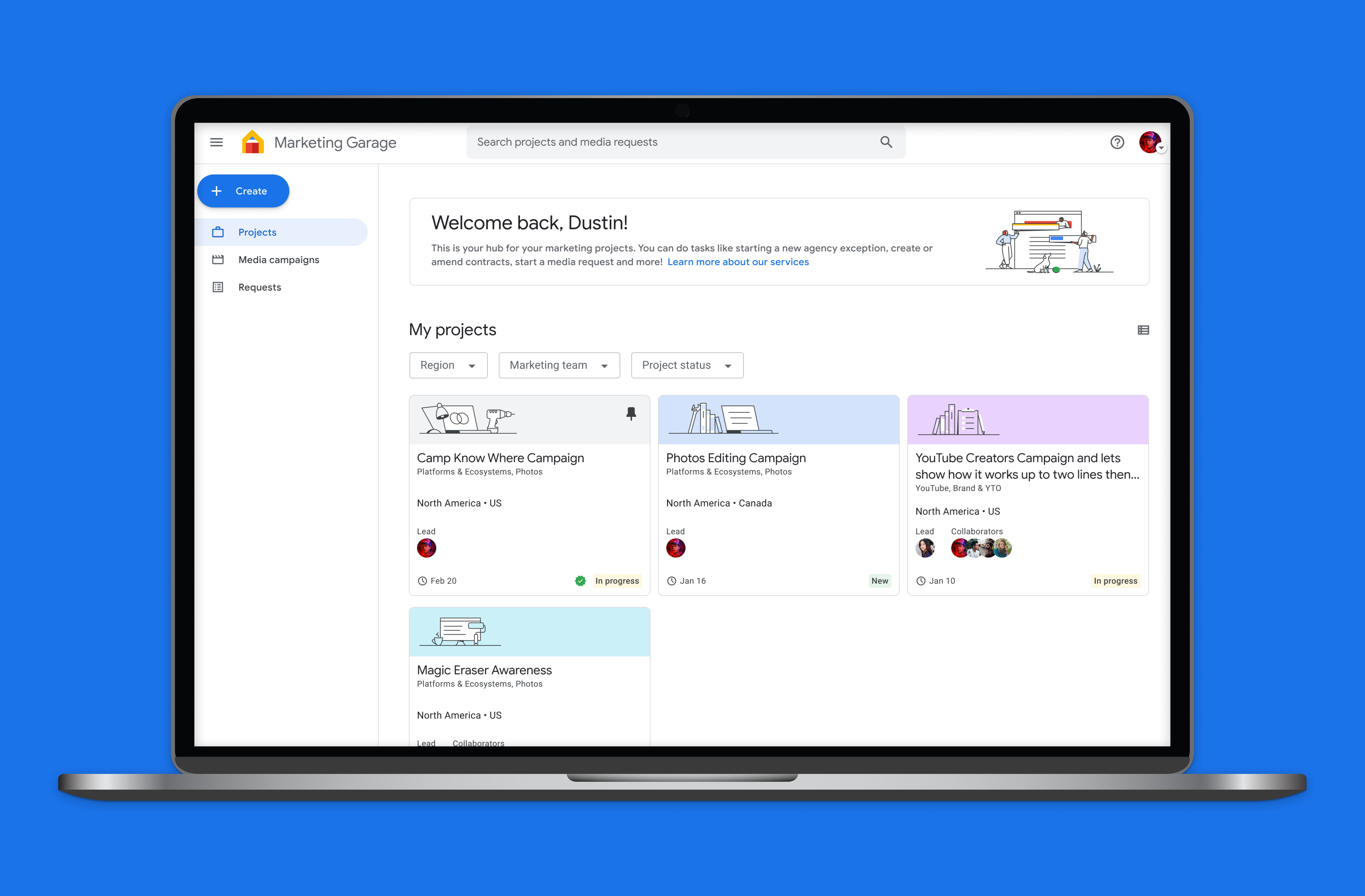
Uncovering the Pain Points: A Deep Dive into User Research
Google's Marketing Garage, while a valuable tool, was struggling to meet the needs of its users. The platform's outdated design and complex processes led to a frustrating user experience, hindering productivity and efficiency. To address these challenges, me and the lead researcher started a comprehensive user research initiative, conducting interviews, surveys, and usability testing with marketers across various teams. Additionally, I lead a heuristic evaluation, cross-functional design jams and reviews to gather diverse perspectives and insights.
The outcome of this work was 3 key pain points: confusing navigation, cumbersome workflows, and scattered information.
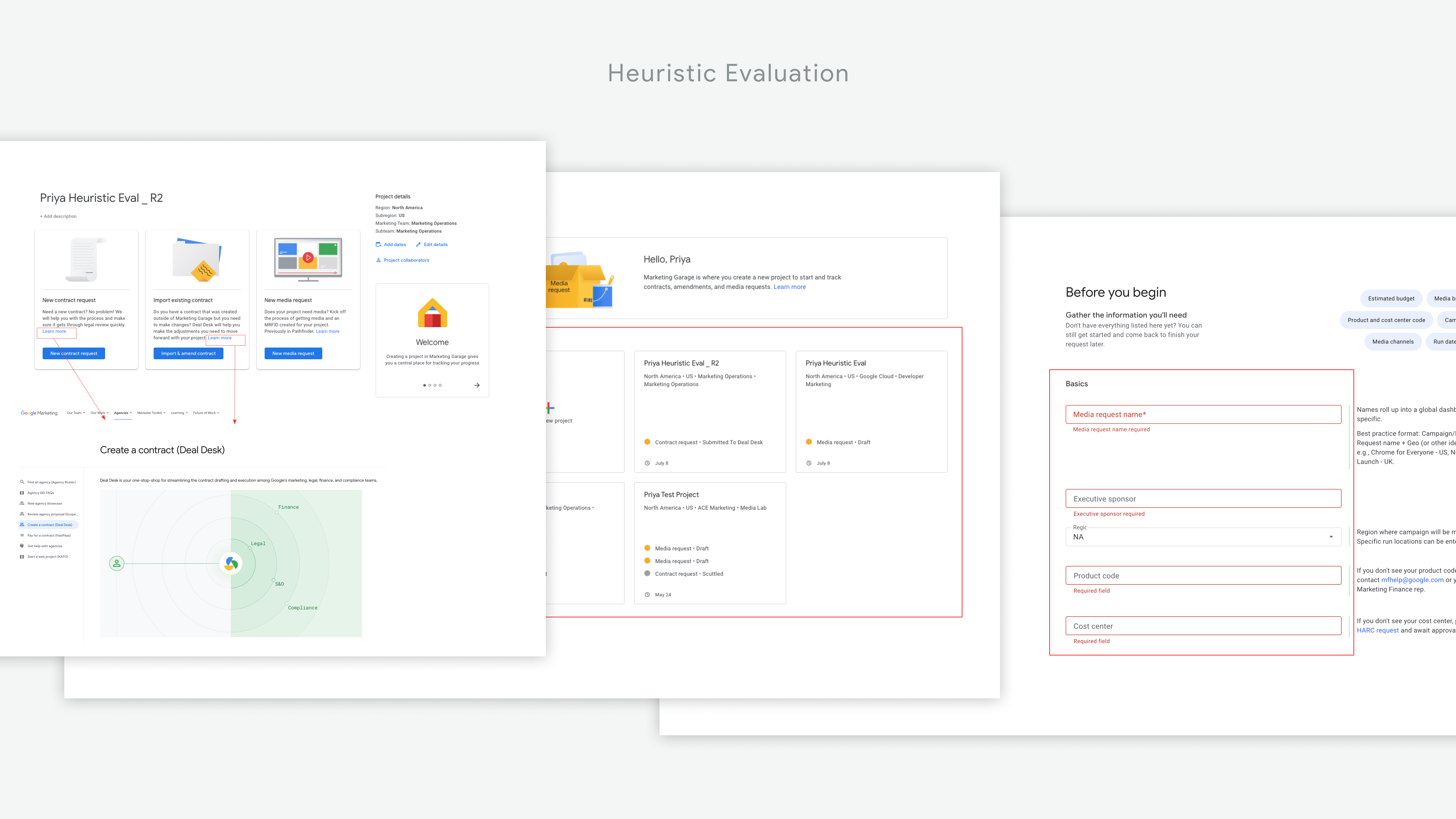
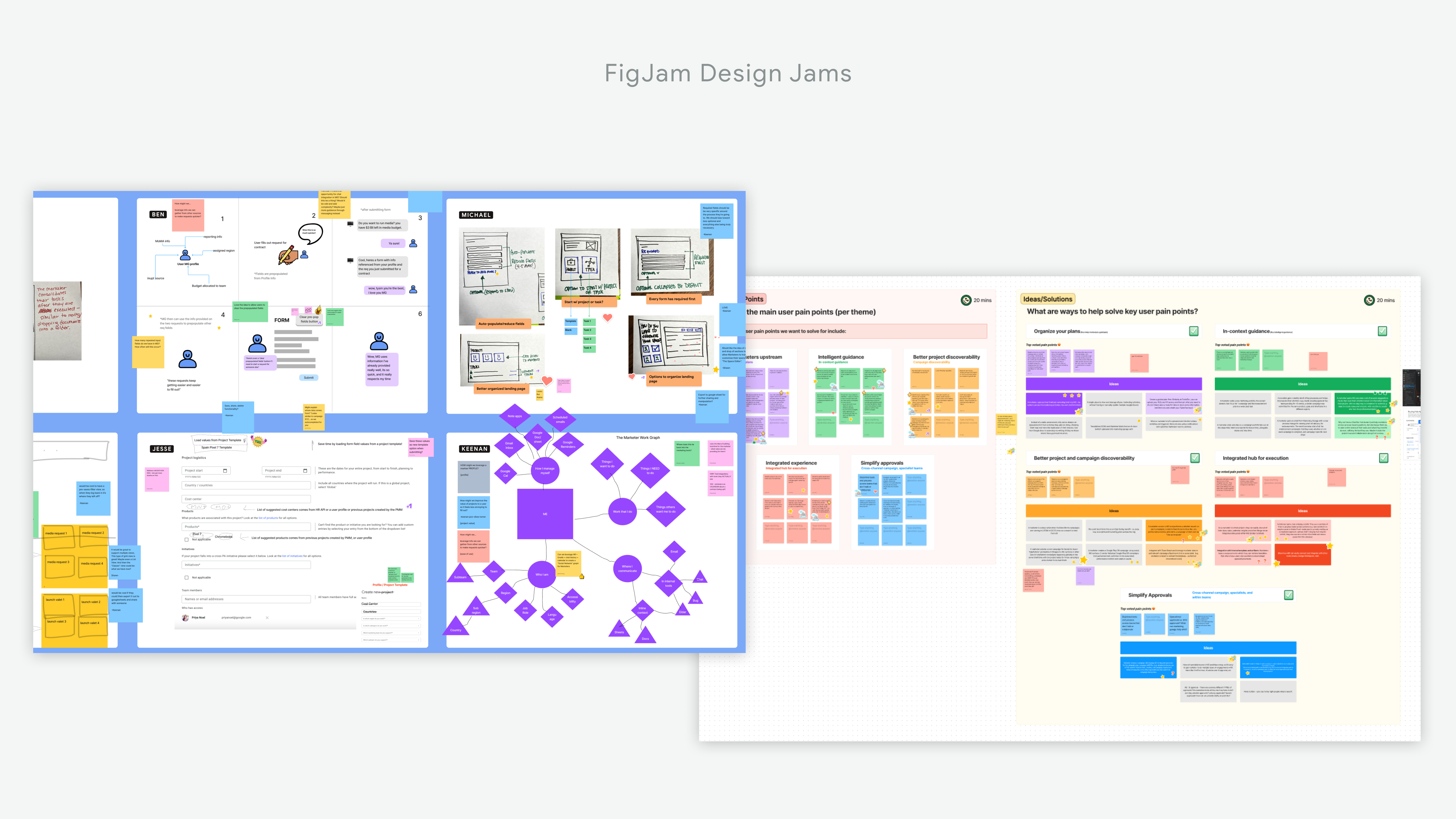
User-Centric Transformation - Redesigning Marketing Garage for Success
To address these issues, I spearheaded a design overhaul, leading a cross-functional team of designers, engineers, and product managers. My mission was to transform Marketing Garage into a high-performing, user-friendly tool. I started with small but impactful enhancements like improved project visibility and updates.
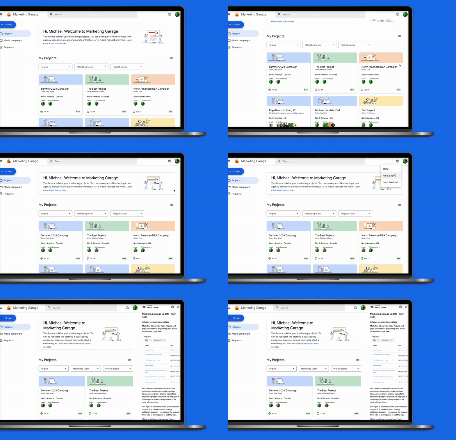
Then, I tackled larger upgrades, such as a redesigned landing page, streamlined filtering options, and simplified task creation.
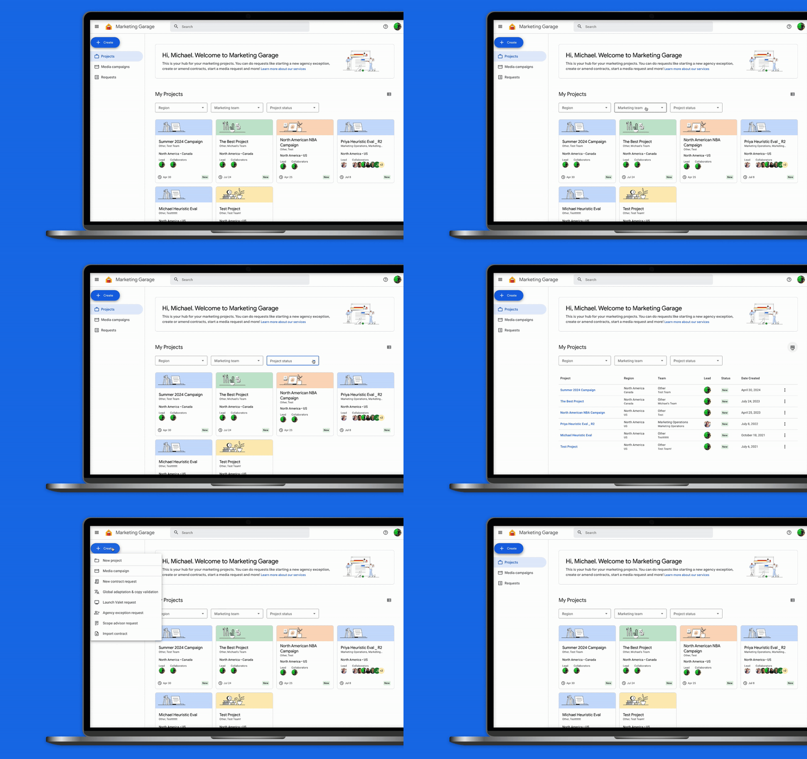
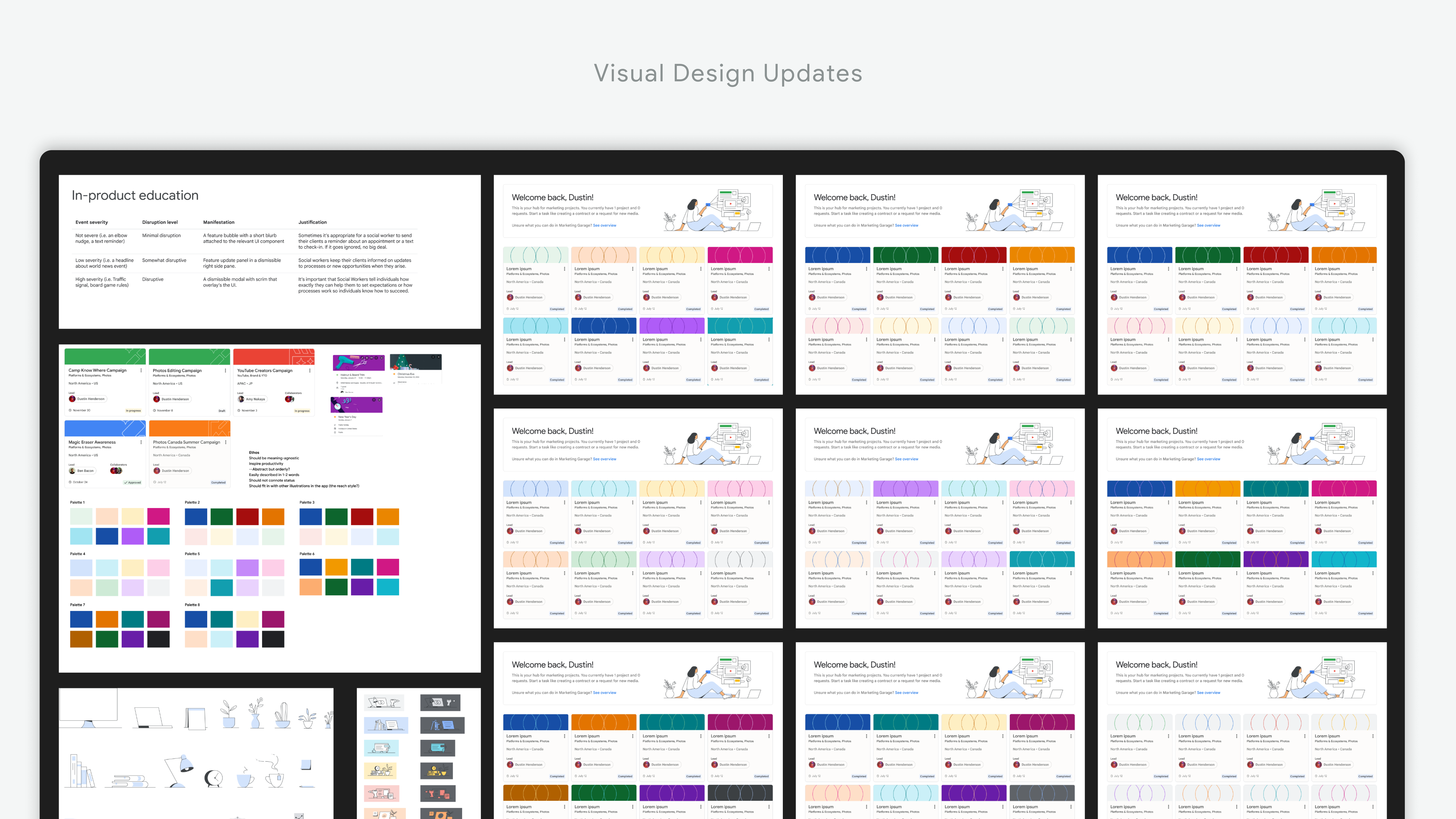
Finally, I infused the platform with a touch of Google's signature personality through a vibrant color palette and playful design elements.
User-Centric Design in Action: 4 Key Improvements That Transformed Marketing Garage
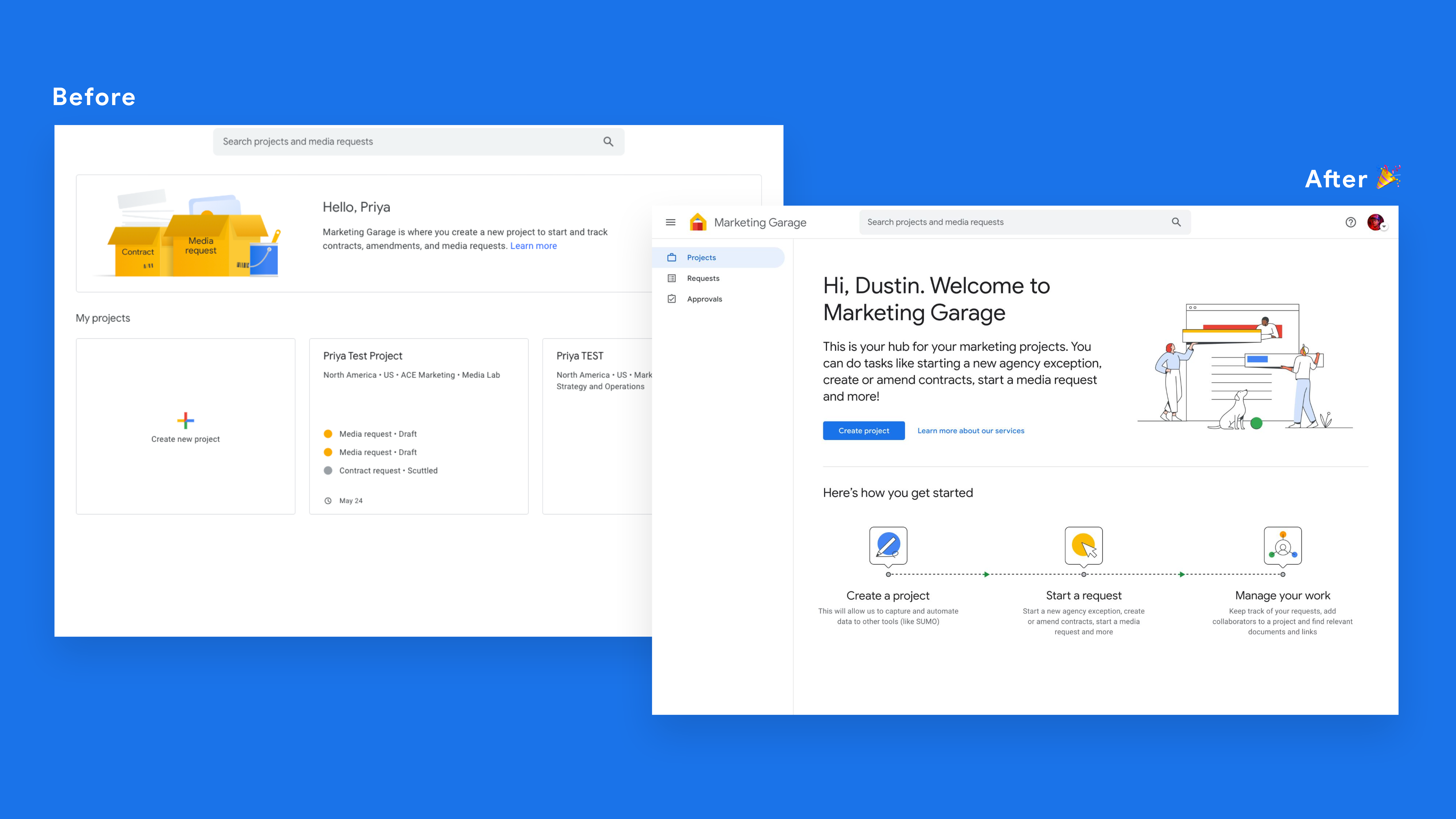
Simplified Onboarding
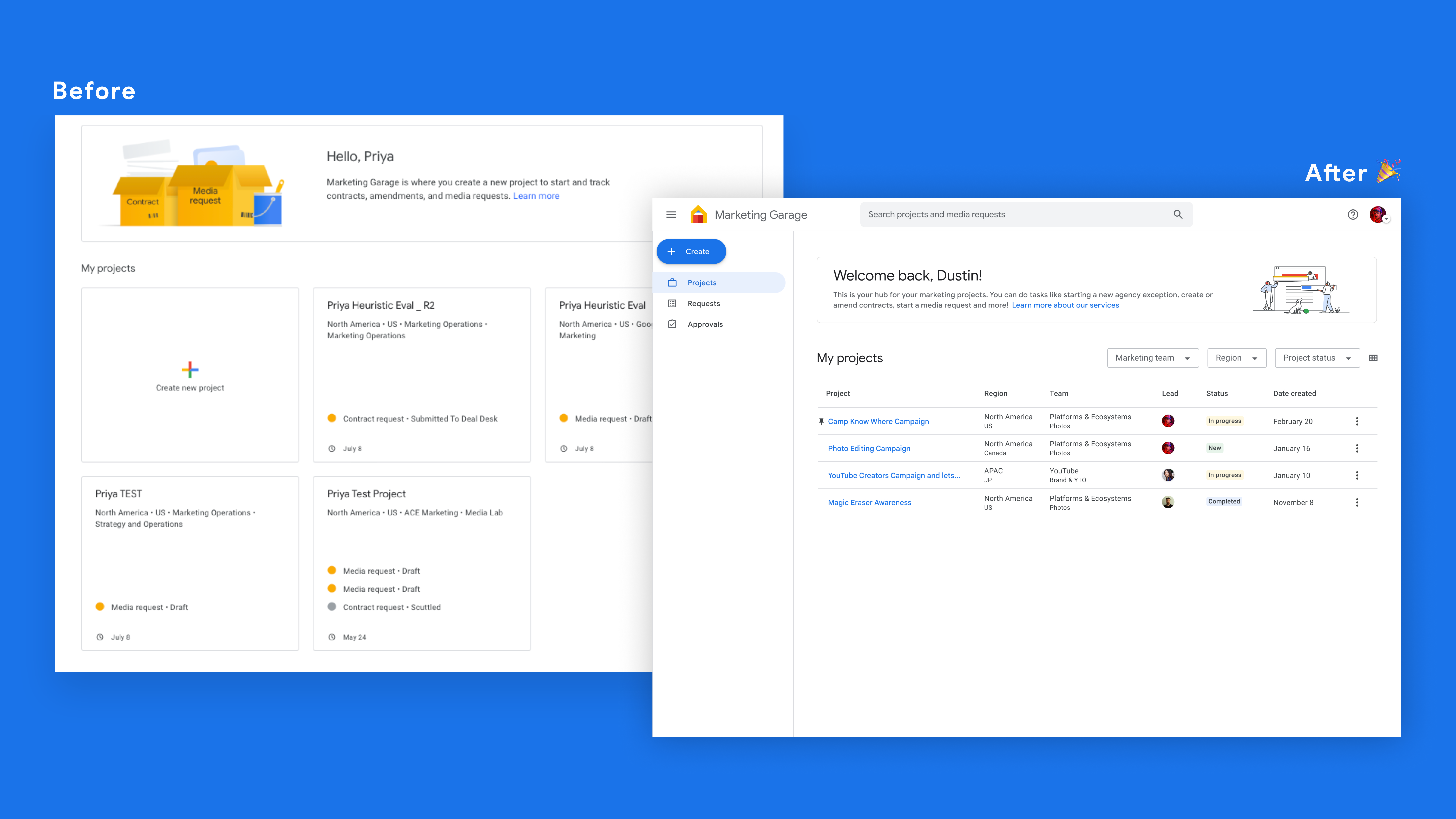
A new welcome screen with step-by-step instructions reduced initial user confusion by 67%.
Streamlined Workflows
Allowing marketers to directly create tasks without a project increased efficiency, addressing a frustration voiced by 81% of users.
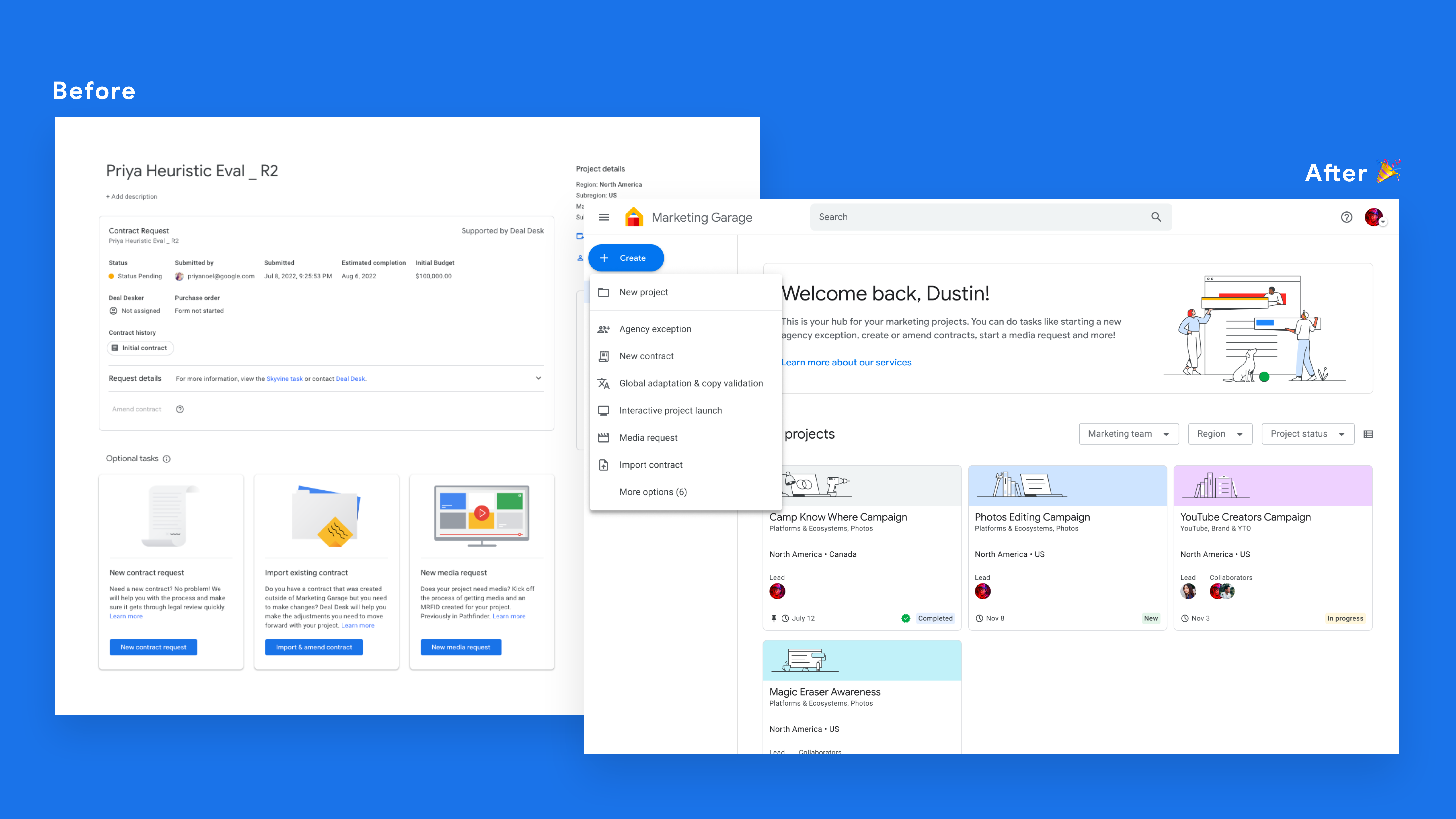
Enhanced Project Management
A revamped dashboard with customizable filters helped users easily navigate and manage their projects, even those with over 100 projects.
Optimized Information Architecture
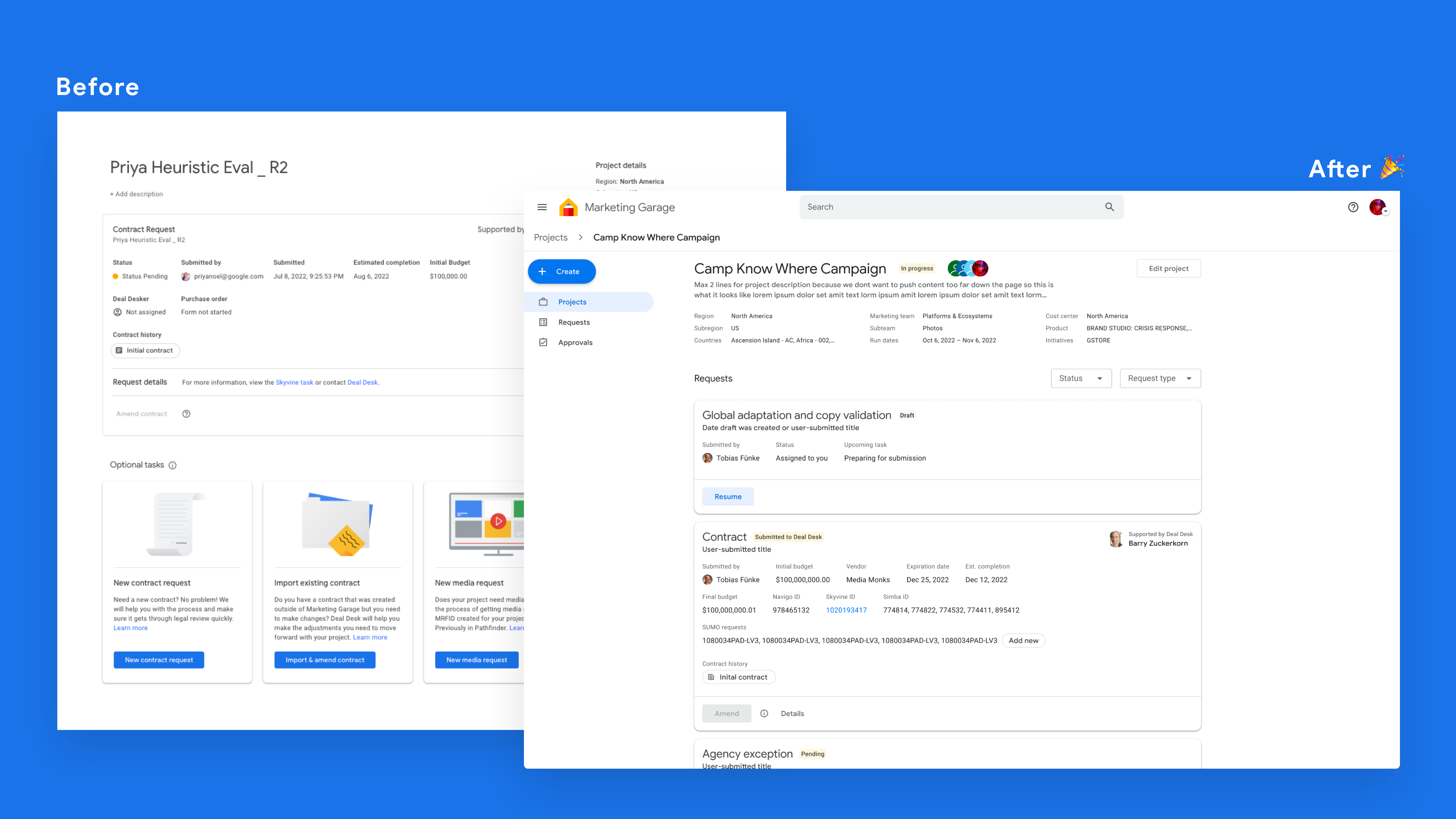
A redesigned details page provided clear, hierarchical access to critical information, addressing the concerns of 63% of users who found the previous layout lacking.
More UX Magic for a 2 Year Vision
The design enhancements mentioned above, along with the implementation of automated guidance, contextual help, streamlined approvals, and a centralized information hub, transformed Marketing Garage into an intuitive and efficient tool.
Automated Guidance
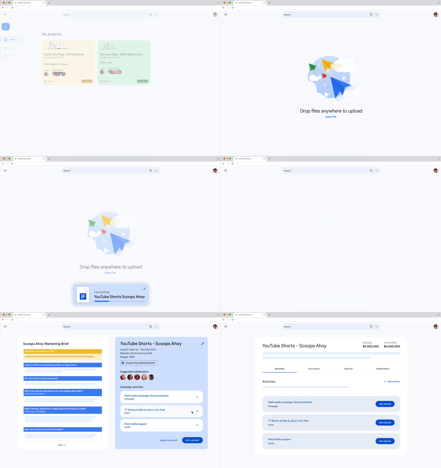
With Magic Transfer, marketers can upload their briefs and Marketing Garage will automatically extract the individual activities and campaign metadata, making it easier to kick-off execution.
Contextual Help
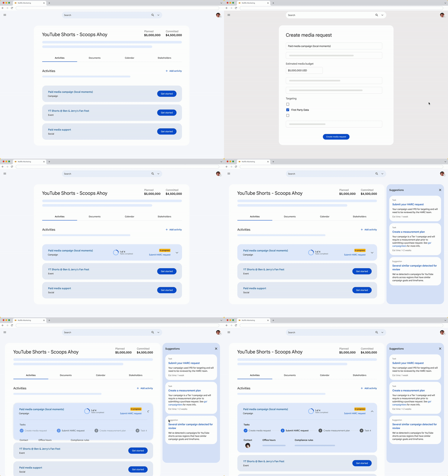
With Smart Suggestions, Marketing Garage will generate campaign-specific suggestions and tasks - both rules-based and AI-based - avoiding guesswork and “gotcha moments” during the execution process.
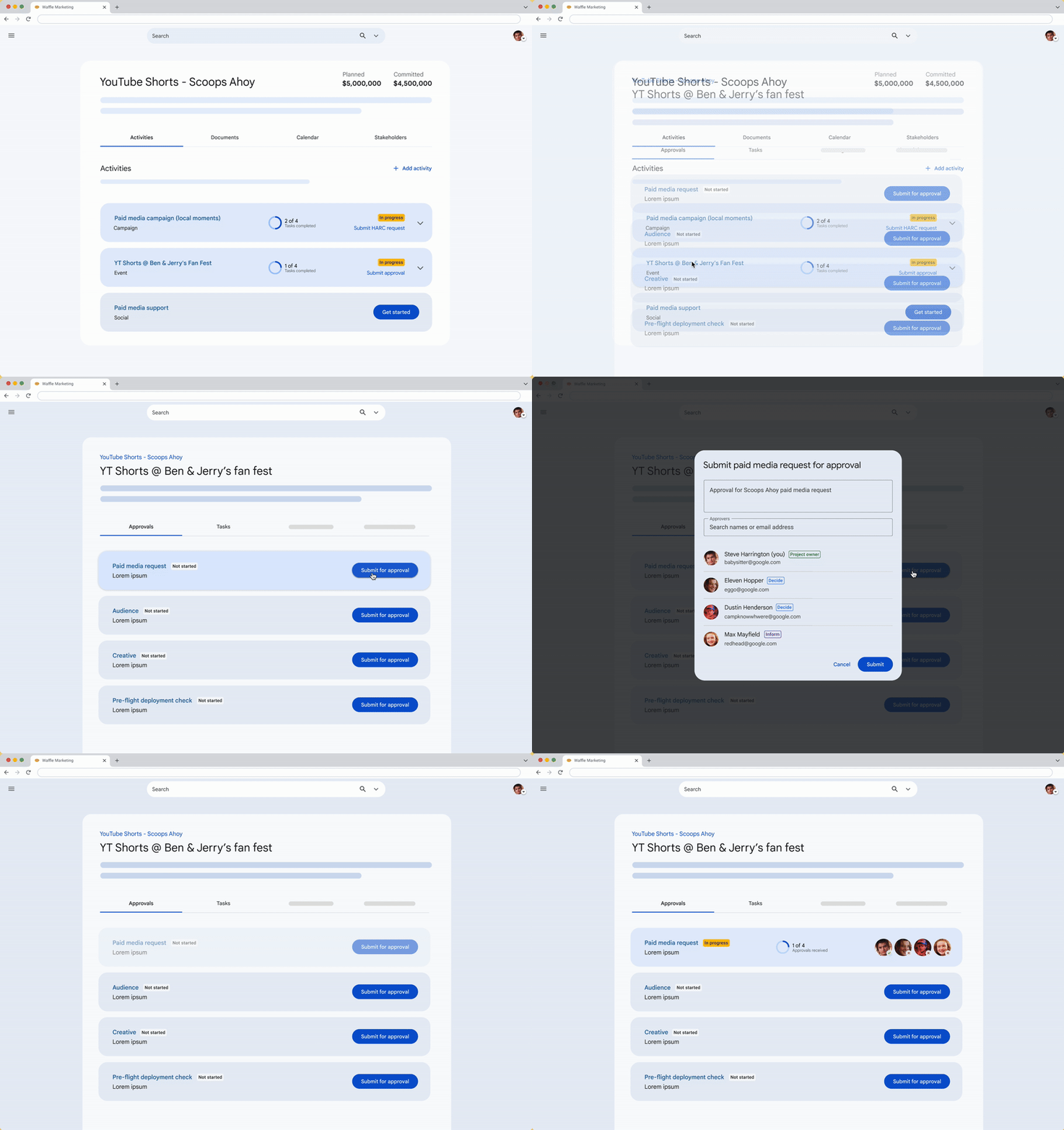
Streamlined Approvals
With Approvals HQ, Marketing Garage will summarize all required approvals for each phase of the marketer’s campaign. Marketers can also submit and manage approvals through Marketing Garage, which integrates to downstream approval systems like Launch and Adobe Proof.
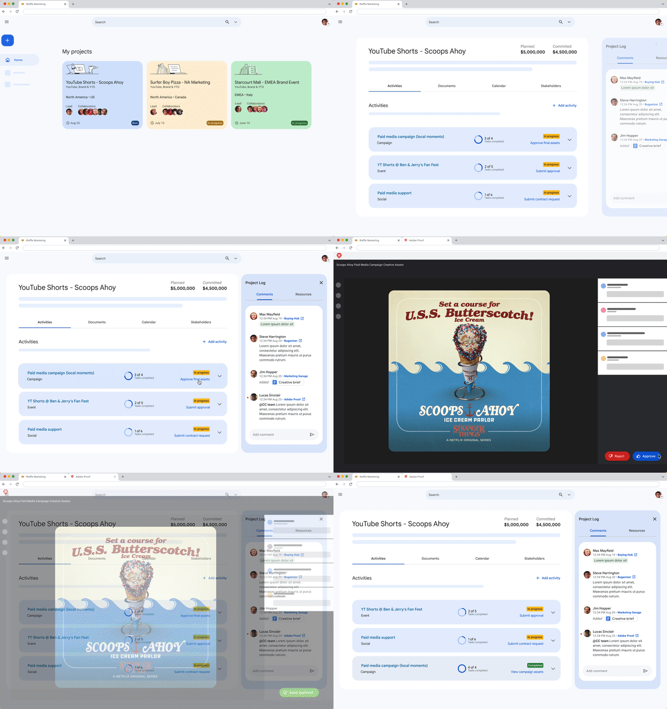
Centralized Information Hub
Marketing Garage provides marketers a holistic view of their projects, integrating and summarizing key information across multiple tools. Marketers can easily view and take action on their campaign tasks, without needing to bookmark campaigns in different tools or creating link-farm docs.
Proof is in the (User Satisfaction) Pudding
The redesigned Marketing Garage not only addressed user pain points but also delivered tangible results, demonstrating the significant impact of user-centric design.
- User satisfaction soared to 62% 😃
- Supported user journeys increased to 9 🤝
- Marketing requests increased to 7,000 🚀
Previously 32%
Previously 6
Previously 5,000
These quantifiable outcomes underscore the success of the redesign and its positive impact on both user experience and business outcomes. By empowering Google's marketing teams to work more effectively and achieve their goals, the revamped Marketing Garage has solidified its position as a valuable asset, driving productivity and innovation across the organization!
You've reached the end of this case study!
If you made it this far, thanks so much for reading through this case study! I'm very excited to share what my team and I have been working on at Google for the past year.
Want to see more projects? Click one of the links below:
Next: "LinkedIn" - Transforming LinkedIn Hiring for Small Business Owners
Previous: "Apple" - Transforming Apple's Training UX